Welcome to the blog of "Cuchi, ¡qué Tipo!". Here you have a small site where you can find some interesting news and contents about the development of typographic love among the local culture where I live in Spain. "Cuchi"… I hope you like it all!
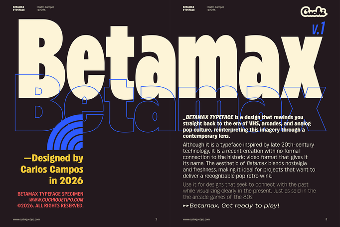
Betamax
February, 2026
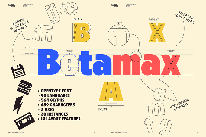
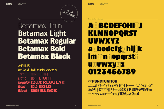
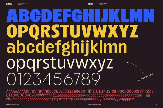
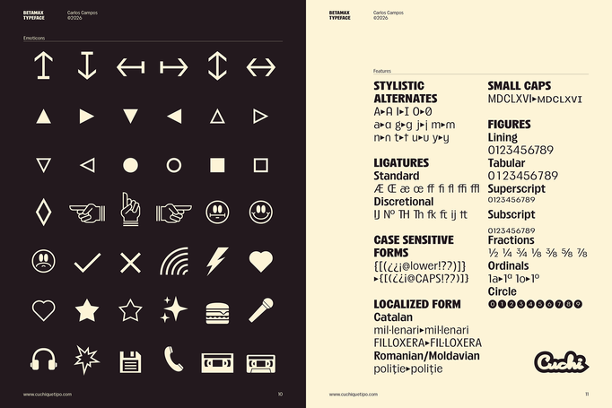
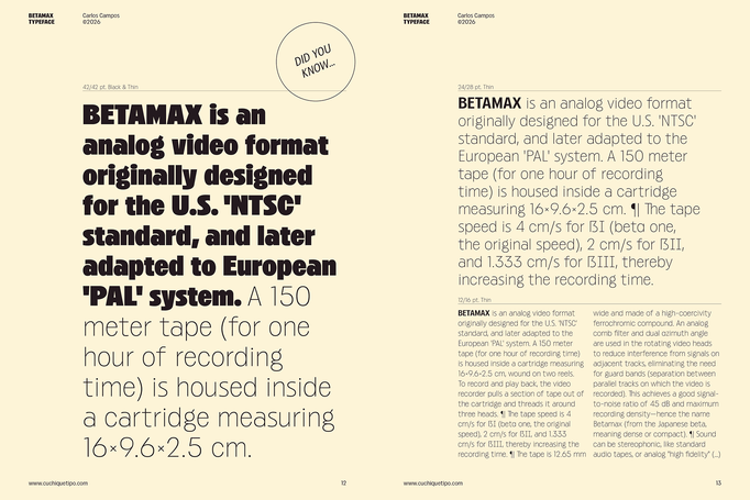
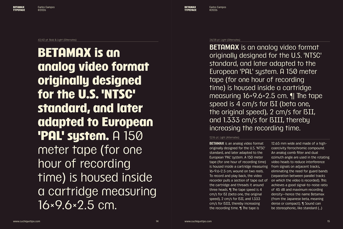
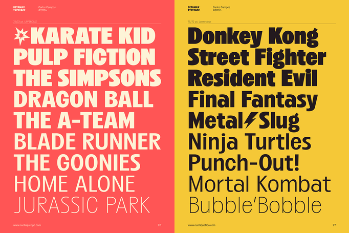
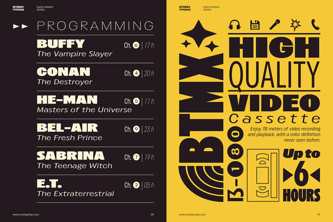
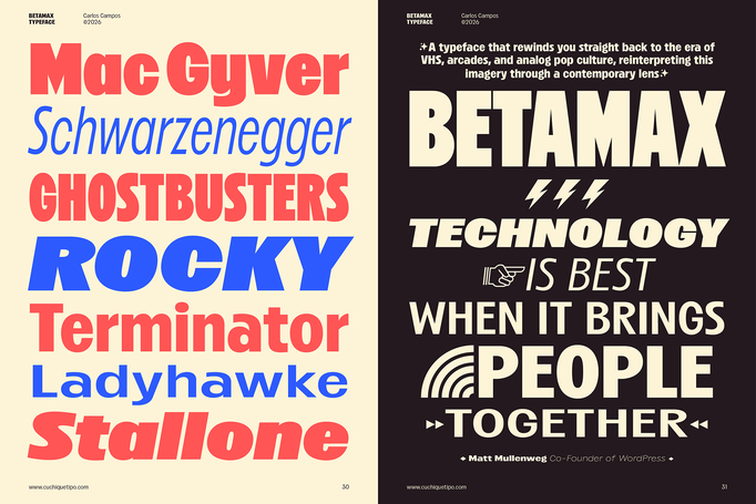
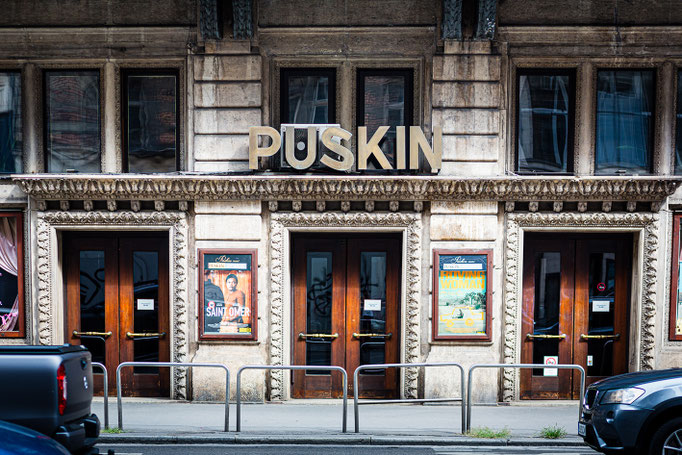
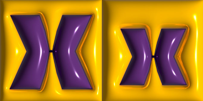
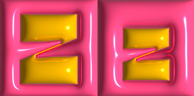
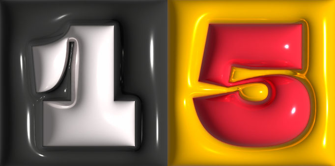
'BETAMAX TYPEFACE' is a design that rewinds you straight back to the era of VHS, arcades, and analog pop culture. Although it is a typeface inspired by late 20th-century technology, it is a recent creation with no formal connection to the historic video format that gives it its name. Just like the arcade games of the 80s: "BETAMAX, GET READY TO PLAY!" (see more in Typefaces section).


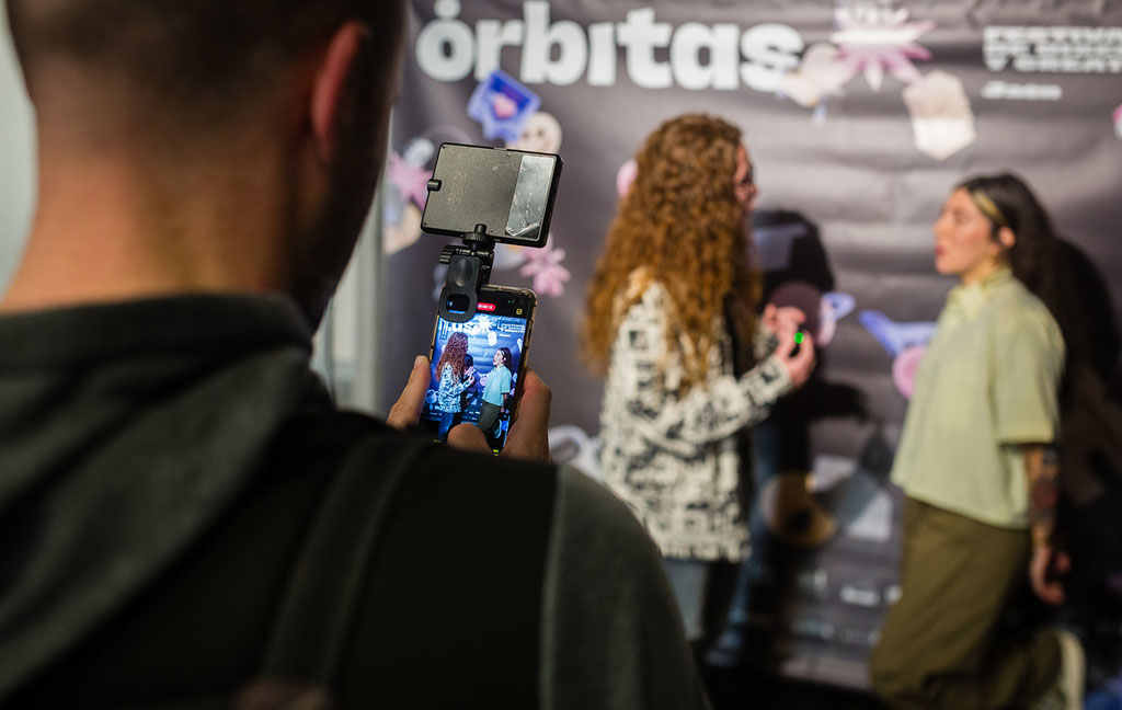
Selekted Bilbao 2025 Awards
December, 2025
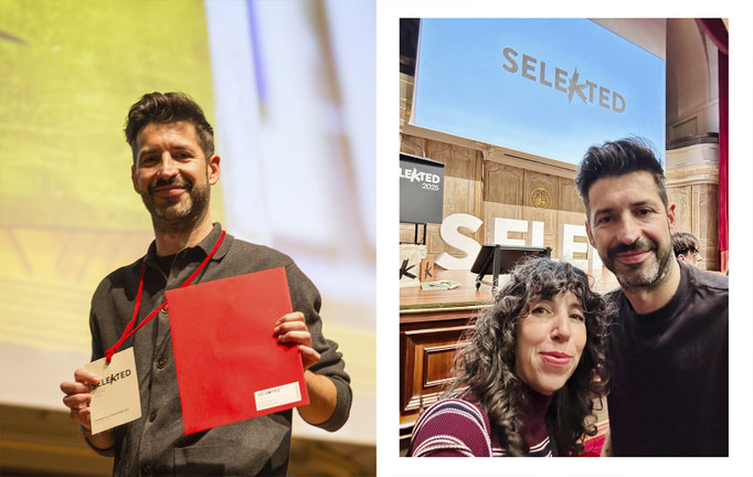
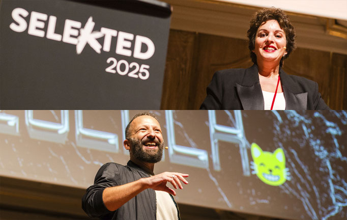
Very grateful to have been recognized as a finalist by the Selekted Bilbao 2025 awards, among hundreds of applicants! I feel very proud of my project "¡Ole, qué tipos!", that you can check here. The lettersigns of Bilbao are so beautiful, and the awards ceremony was fantastic and included talks by my admired Ana Gea and Francesco Furno. Many thanks to the organization and congratulations to the other award winners! (click on each image to see it larger)


Heirs of the Letter 1st encounter
November, 2025
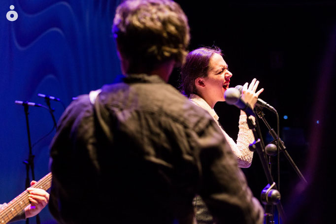
In this video you can see my talk Ole, qué Tipos!, where I discussed my typographic projects related to the graphic heritage from Andalusia, Spain. All the presentations with great people from this international encounter are here. Many thanks to Leyenda Type for organizing such amazing event!

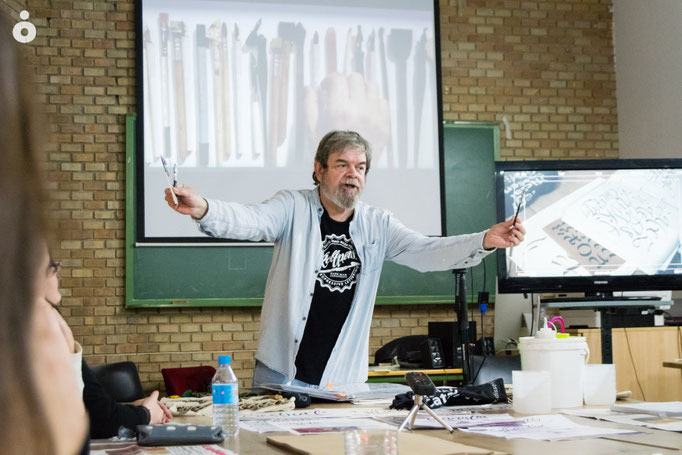
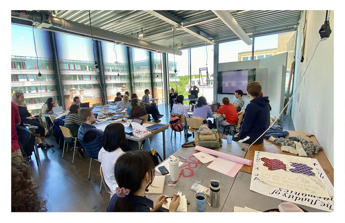
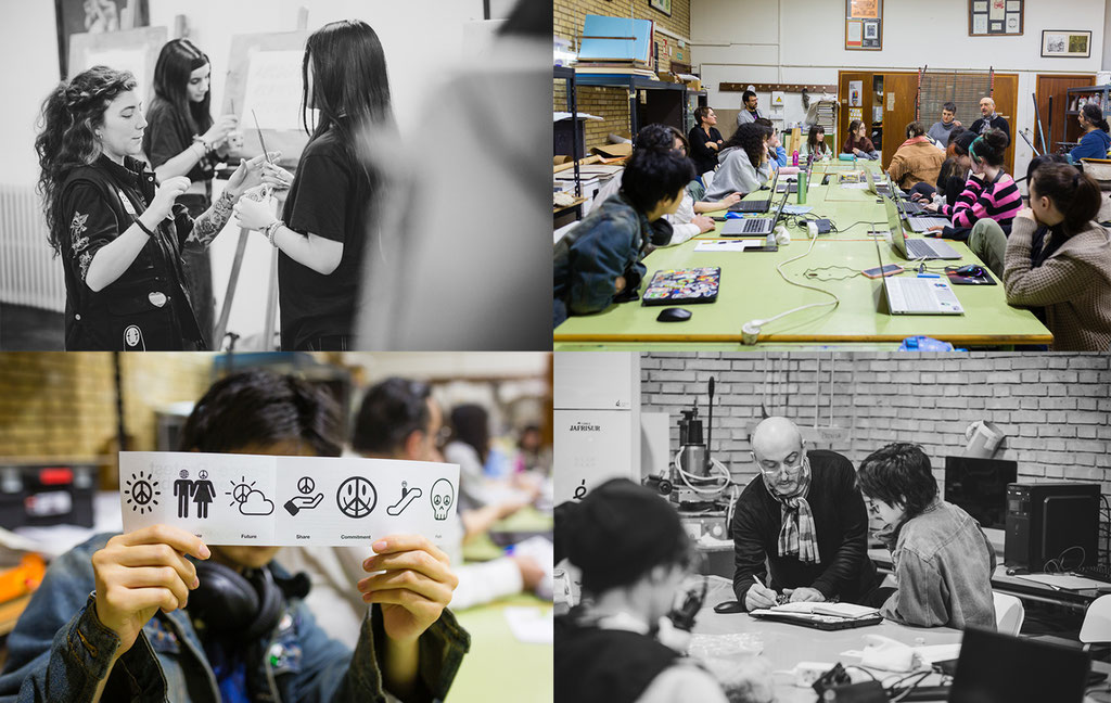
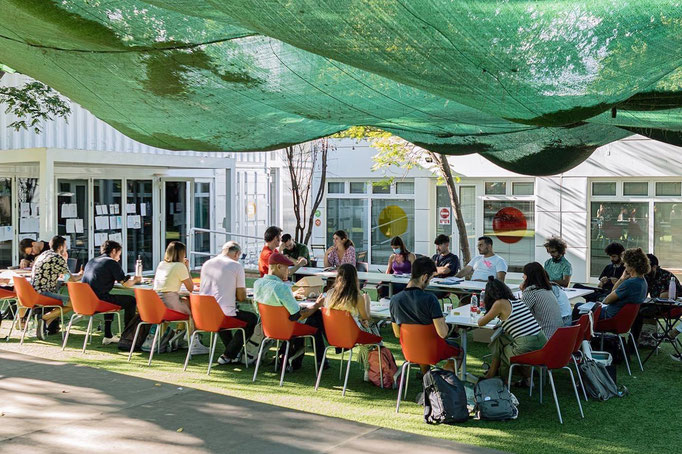
Typography classes at the Academy of Arts
October, 2025
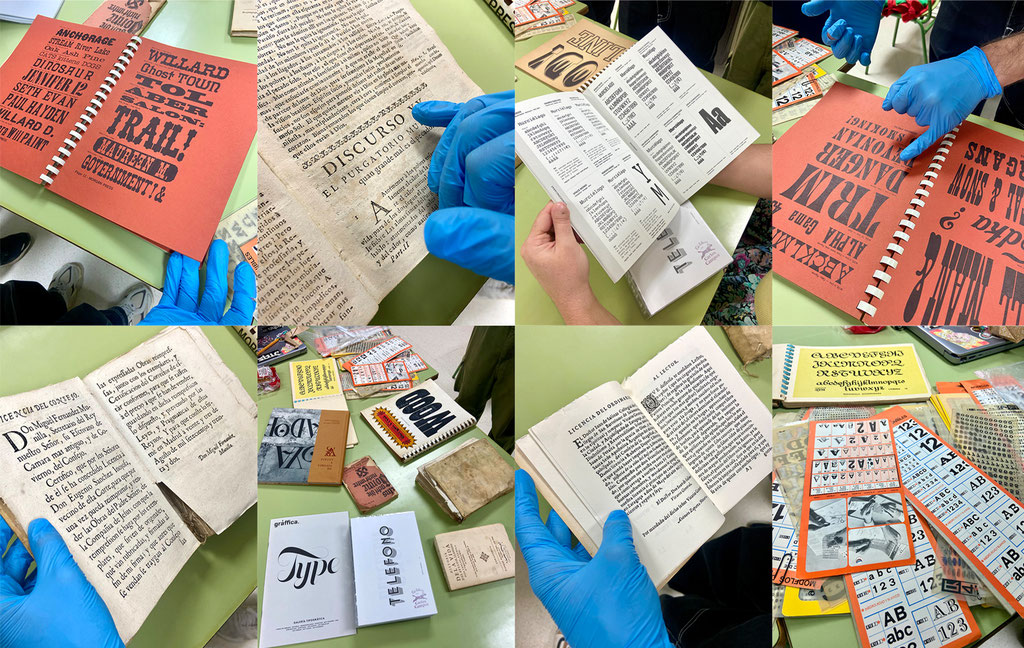
Tons of fun and learning in these first few weeks of the typography course at EE. AA. SS. Diseño Jaén. From design of lettersigns to researching old specimens and books, including a typographic stroll through the city center… We're having a blast this year! (click on each image to see it larger)


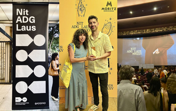
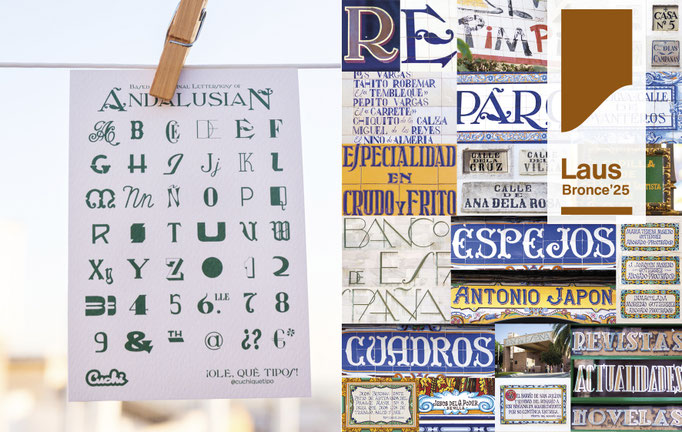
ADG Laus Bronze Award!
June, 2025
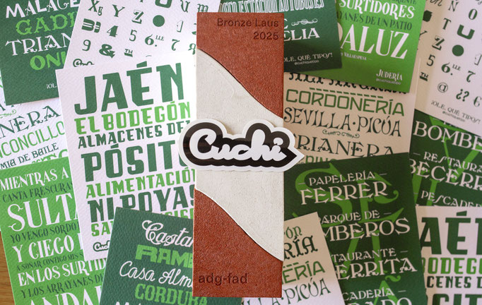
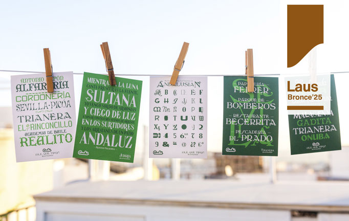
I'm so happy to have been recognized with a bronze award by the ADG-FAD, for my project "¡Ole, qué tipos!", in the category of "Experimental Typography". I feel very proud to have been awarded by such a prestigious organization. Many thanks to the jury, to all lovers of typography, heritage, and design, and congratulations to the other award winners. More info about this project here, or the full catalogue (click on each image to see it larger).


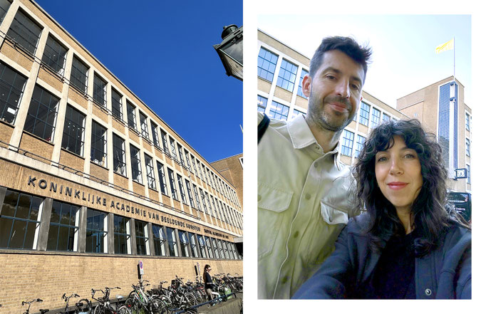
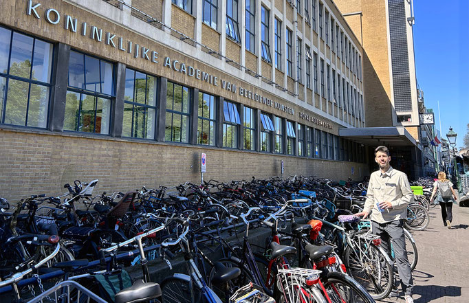
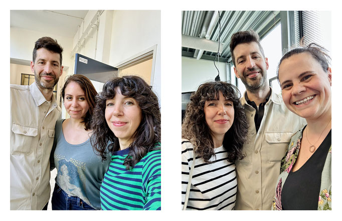
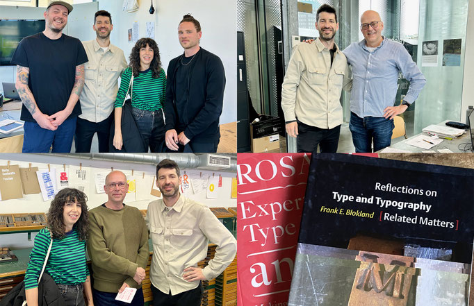
Visiting KABK The Hague
May, 2025
During may 2025, Viky Rodríguez (Head of Graphic Design Department in EASD José Nogué de Jaén) and I visited the Royal Academy of Art of The Hague (KABK), as part of the Erasmus+ exchange program. Many thanks to all the professors and staff of the Bachelor of Graphic Design program who treated us so kindly there. As we could see, the KABK is a great academy that educates students to become independent and self-aware artists and designers. (click on each image to see it larger)

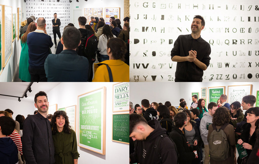
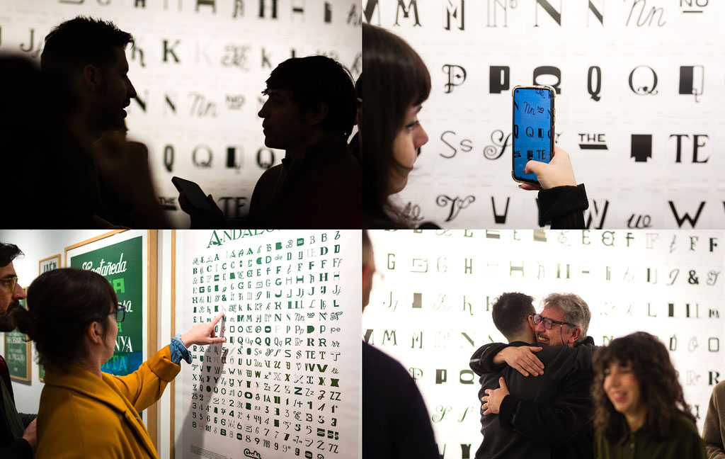
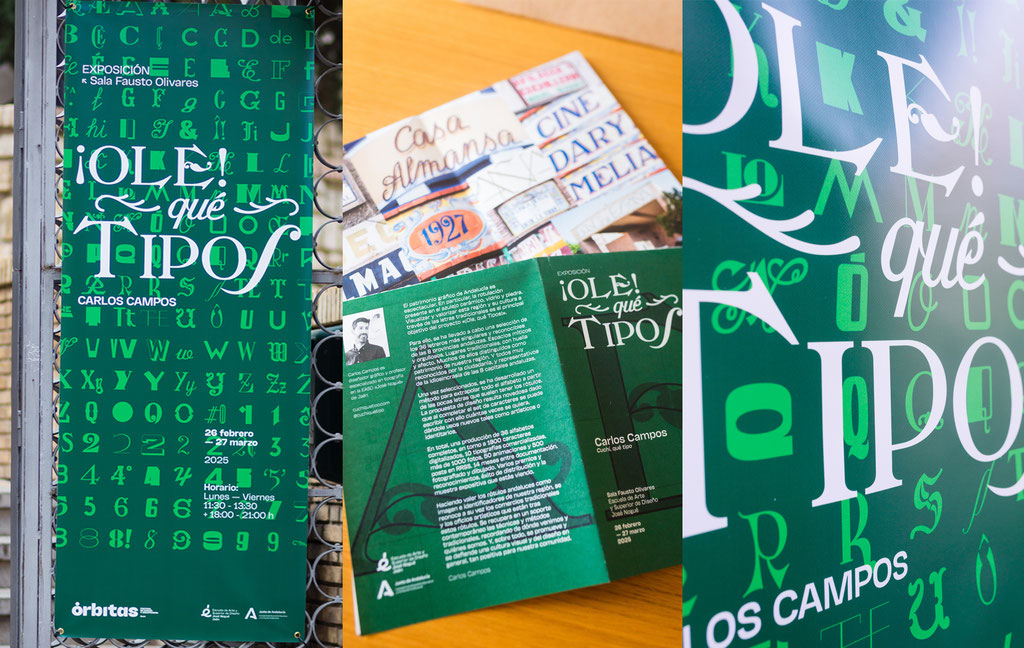
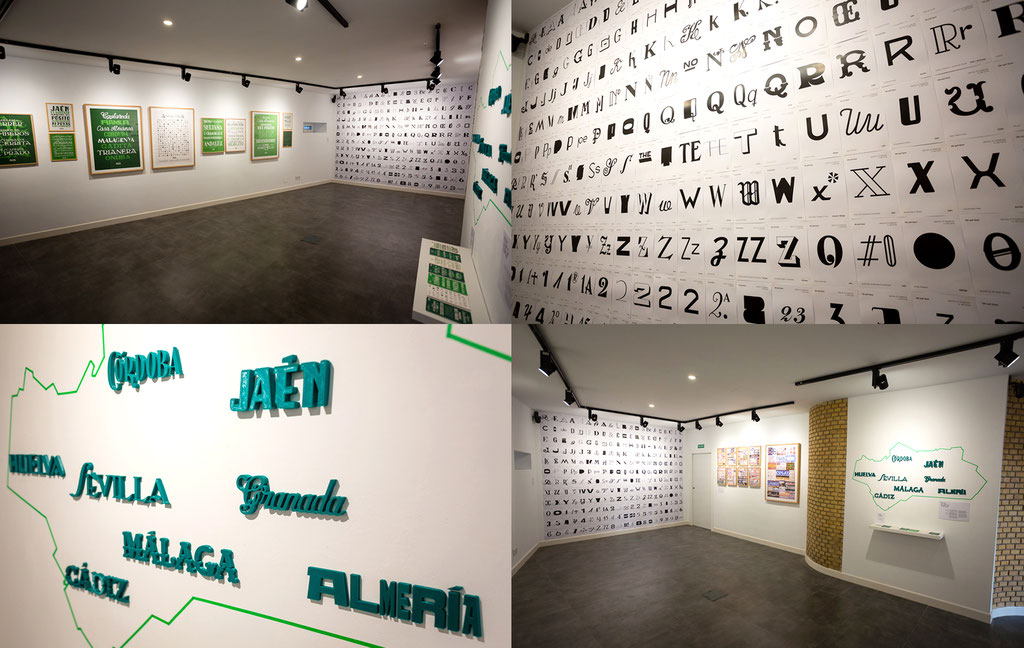
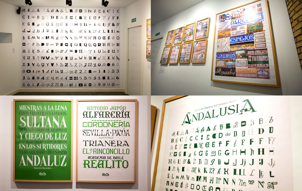
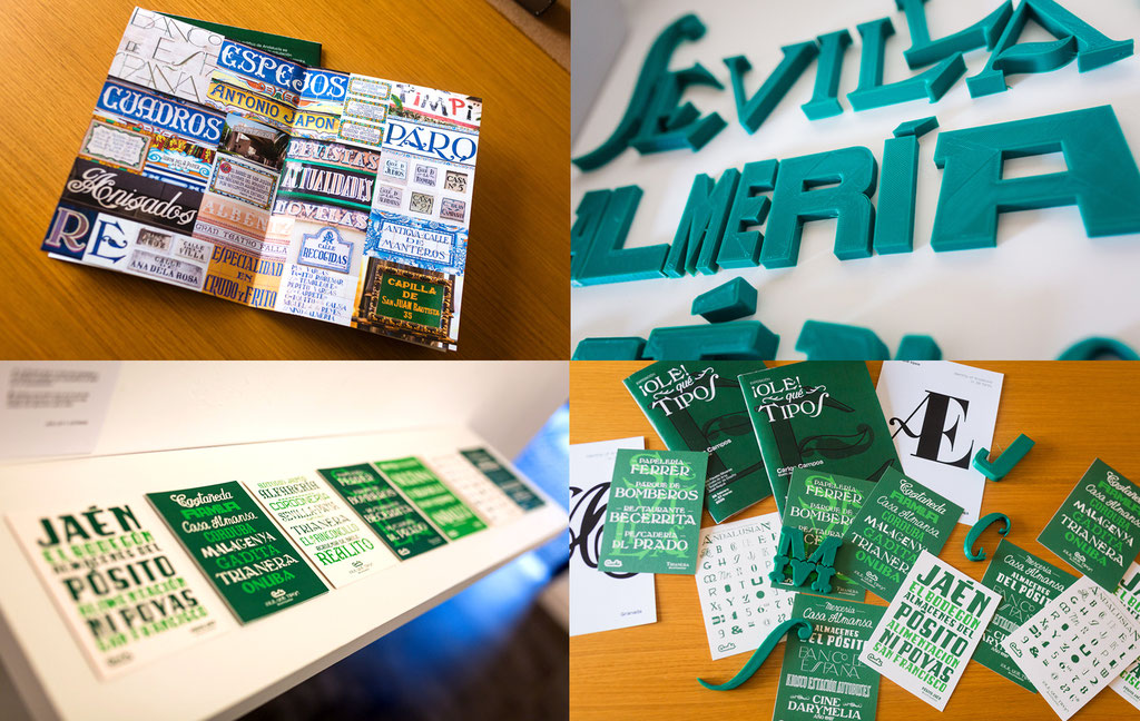
¡Ole, qué Tipos! - The exhibition
February, 2025
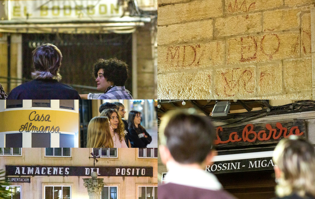
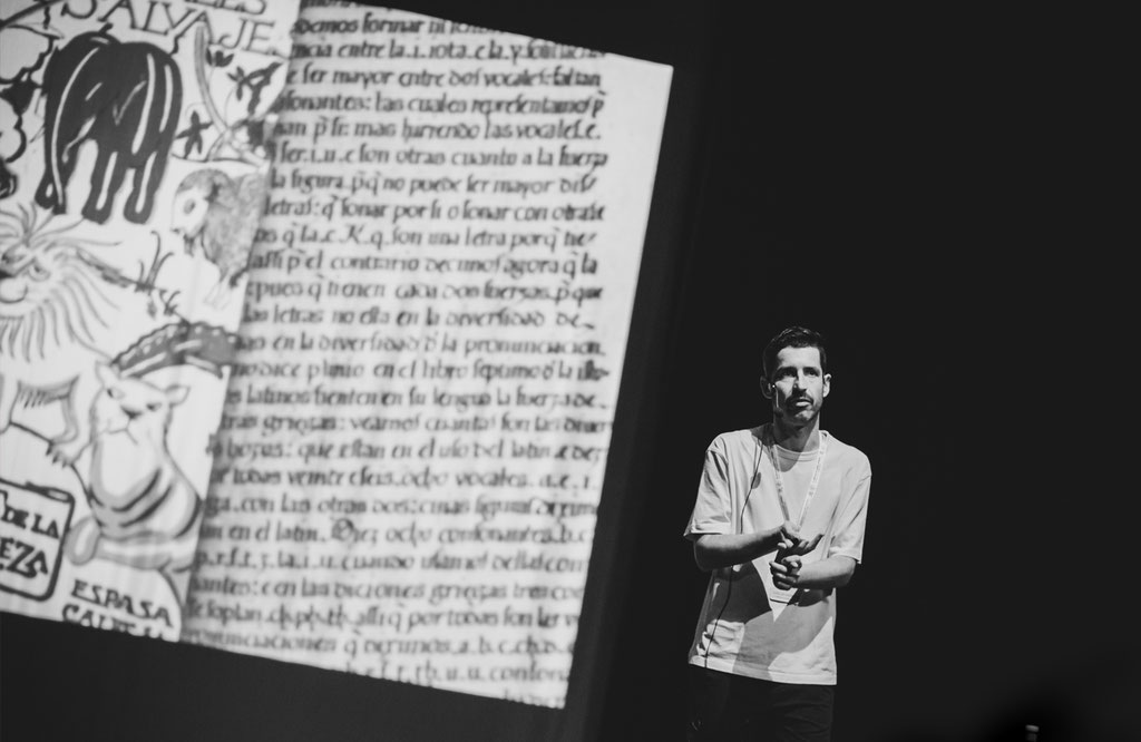
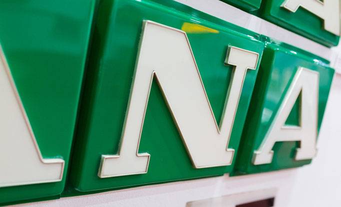
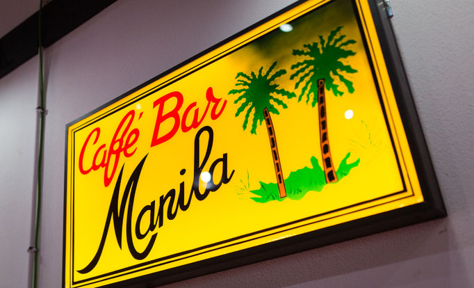
You can now visit the “Ole, qué Tipos” exhibition at the "School of Art José Nogué" in Jaén (Andalusia). A project with the objective of enhancing the traditional letters of the lettering present in the ceramic tile, glass and stone of Andalusia, through the digital interpretation in typefaces of the most emblematic and mythic signs from here. You can see more on "Typefaces", and the full project here! (click on each image to see it larger)


¡Ole, qué Tipos! - Reel
October, 2024
🔈 SOUND ON! In this project you can find the digital interpretation in typefaces of the most emblematic signs of Andalusia: classical letters painted from Seville, lapidary carved in stones from Cordoba, or tiles with the festive mood from Malaga, among others. The fact of converting these traditional lettersigns to typographic software recovers them forever, and allows you to give them new uses such as artistic, identity or touristic. See more on "Typefaces"!
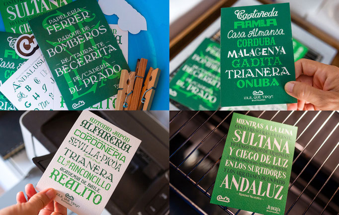
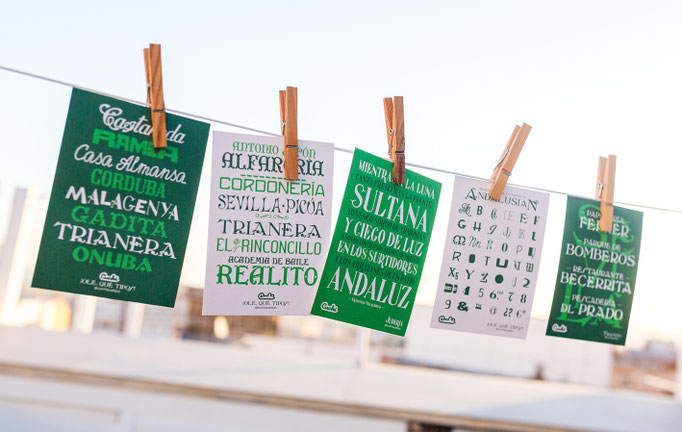
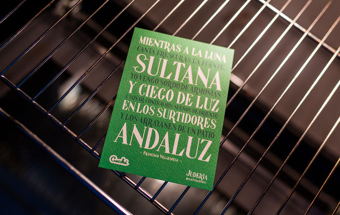
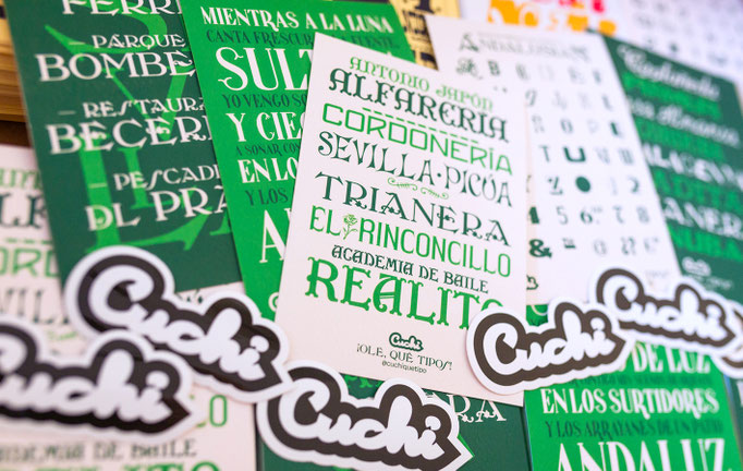
¡Ole, qué Tipos!
September, 2024
Brand new fresh from the washing machine, the oven, or the printer, this is the magnificent set of postcards with the most beautiful letters of the most emblematic signs of Andalucia! The fact of converting some to typefaces recovers them forever, and allows you to give them brand new uses. Also, it has been awarded by the Andalusian Association of Designers (AAD) as the best project 2024 in the Typography & Lettering category! You can see the full project here (click on each image to see it larger).


Cuchi Reel
September, 2024
SOUND ON! 🔊🔊
I share with you this great video of my typefaces work, made by the great Viky Rodríguez! I hope you like it!
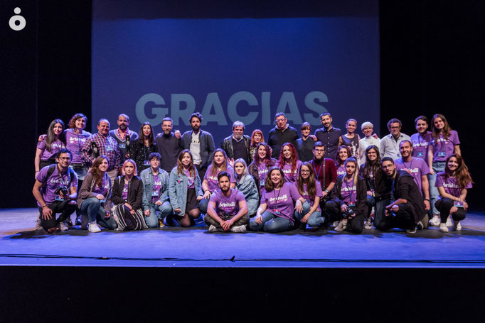
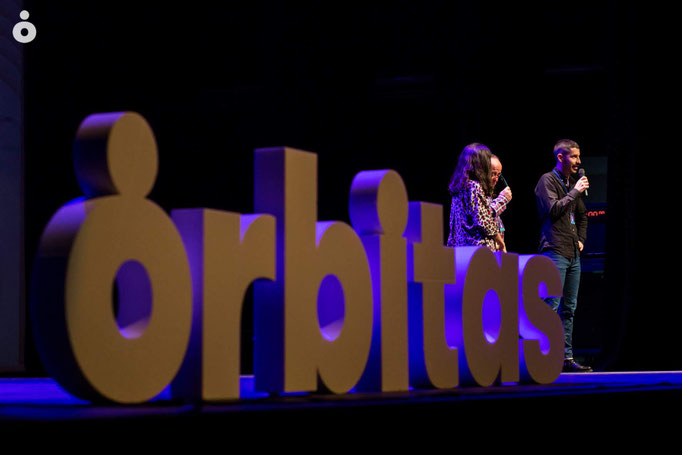
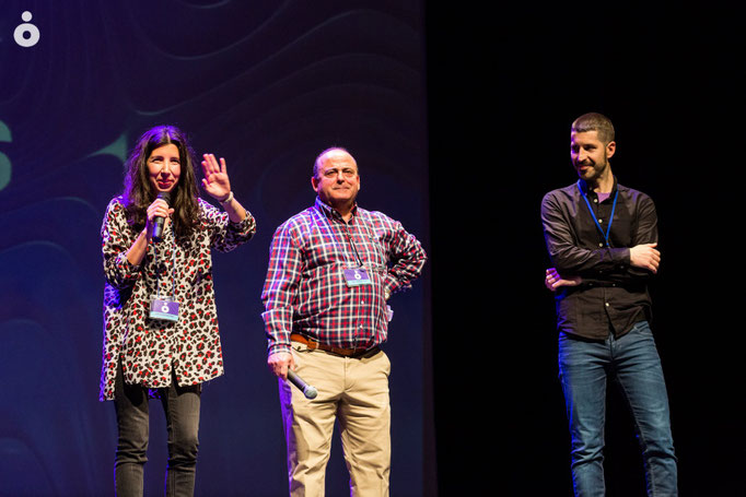
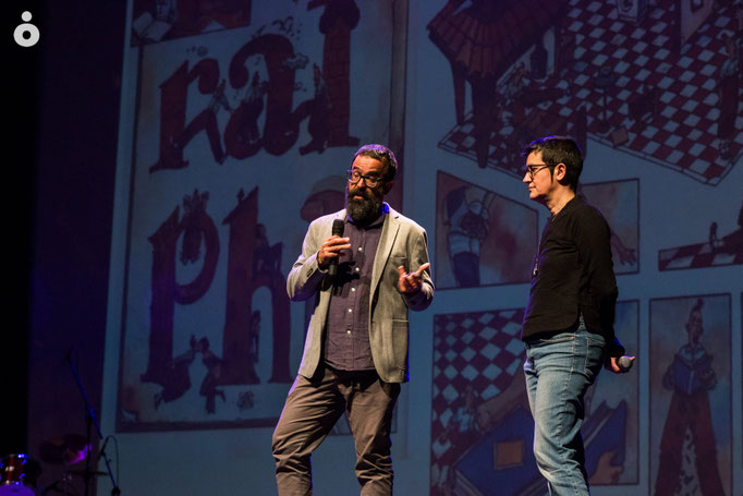
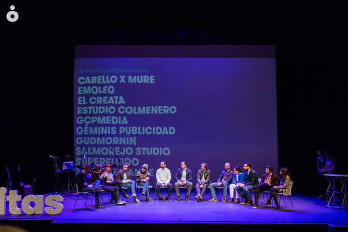
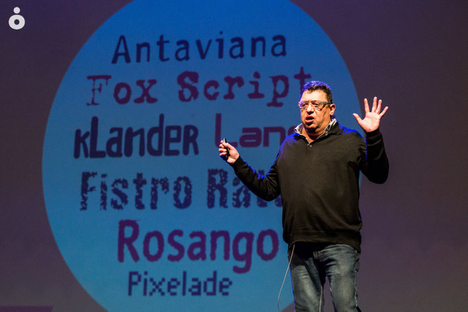
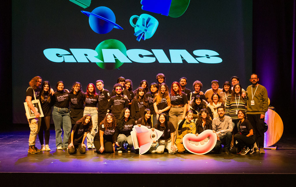
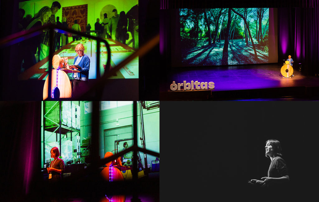
Órbitas Jaén 2024
March, 2024
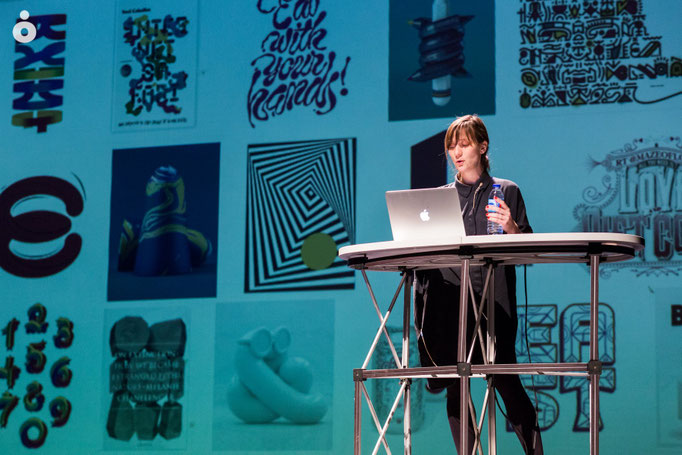
2024 edition of "Órbitas Jaén, encuentro con creatives estelares / Orbitas, meeting with stellar creatives" was a sucess! Over again, we are glad to say that this event brought to the city of Jaén the highest references of national creativity: Marisa Gallén, Un Mundo Feliz, Madame Letters, Ingrid Picanyol… among others. Thanks to everyone who made it possible, especially to the students of EAS. See you next year! (click on each image to see it larger)


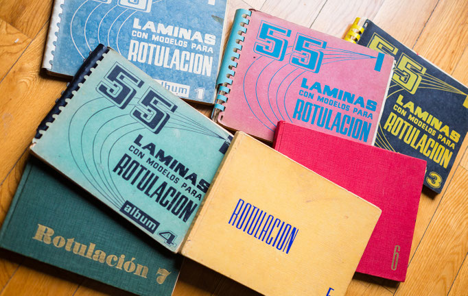
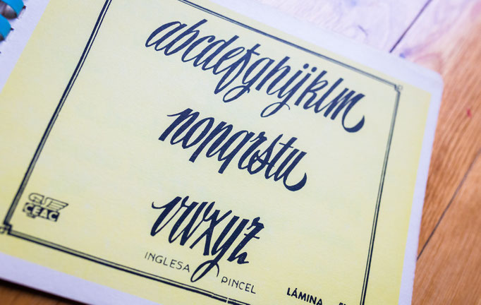
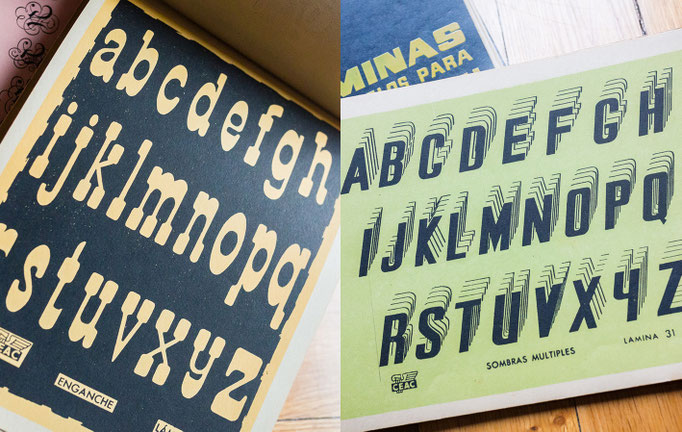
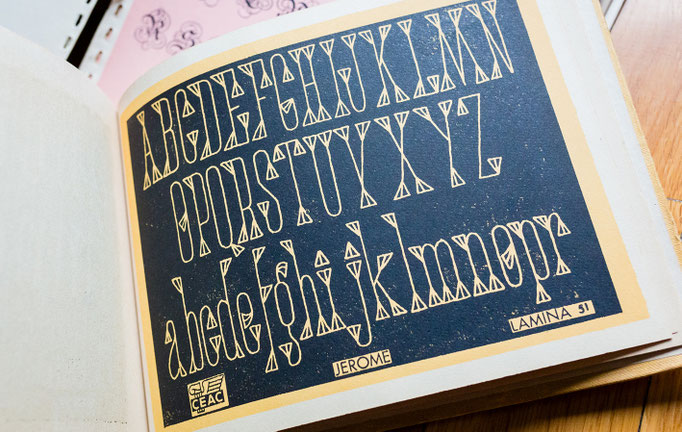
60's Lettering Models Collection
December, 2023
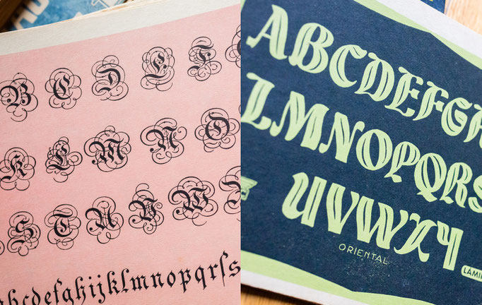
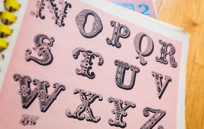
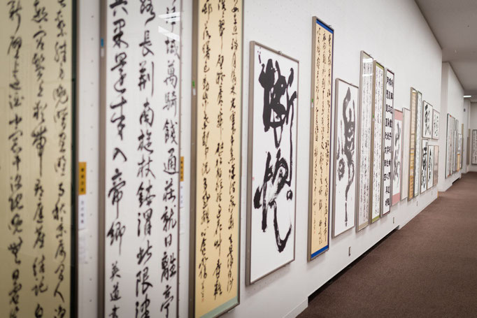
“CEAC 60´s Lettering" is one of the collections I like the most for my library of “classics”. Here is shown dozens of showcases and examples of graphic and commercial signage, that served as a model for many of the signs that we can still see today in Spain (whether painted, made of metal, plastic or other materials...). An incredible and delicious source of retro inspiration! (click on each image to see it larger)


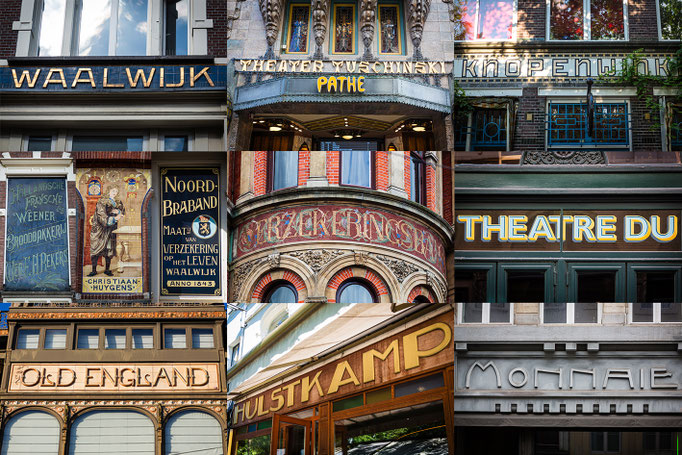
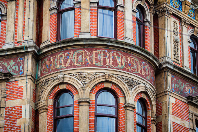
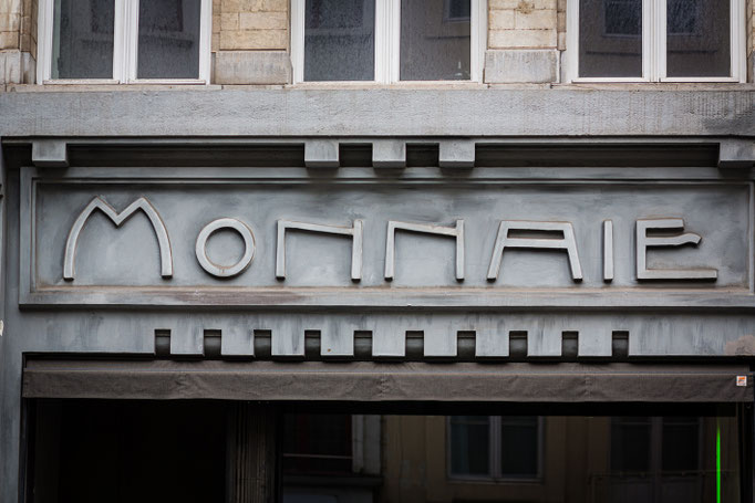
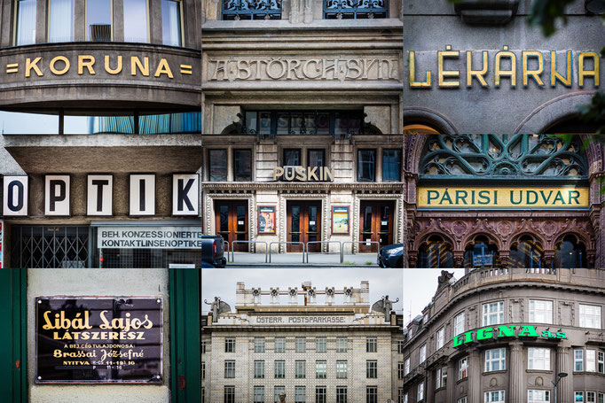
Letters of Europe journey
August, 2023
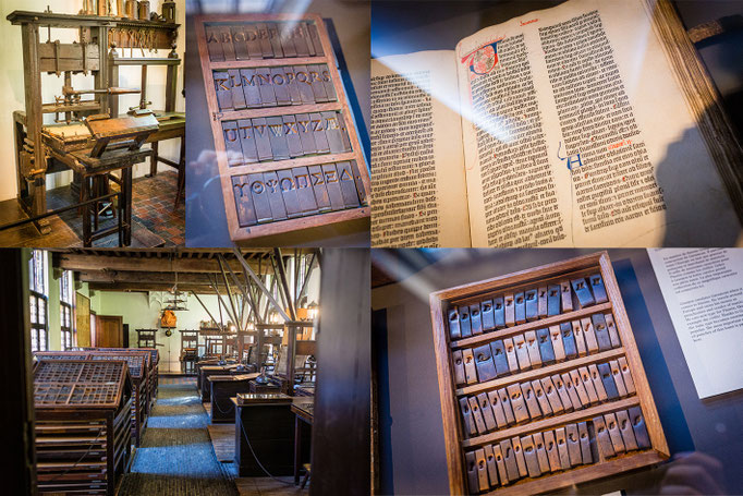
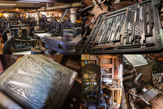
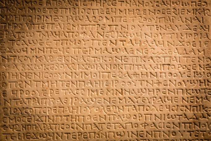
This summer I´ve been traveling through Europe in search of letters; Budapest, Vienna, Prague, Antwerp and Brussels are all marvelous cities of the old continent that contains wonders of lettersigns on their facades, as well as the Plantin-Moretus museum, a UNESCO World Heritage site and the private printing collection Letter-Kunde, kindly directed by Patrick Goossens. Such a pleasure to know these beautiful places! (click on each image to see it larger)


36 Days Of Type 2023
May, 2023
Just finished the 10th edition of 36 Days Of Type challenge, and these are my final characters set, both caps and minuscules! They are from my typeface Zenit, and you can see them all here, hope you like! Thanks to "Treintayseis Studio" for organizing such an amazing challenge through the years, see you in 2024! (click on each image to see it larger)


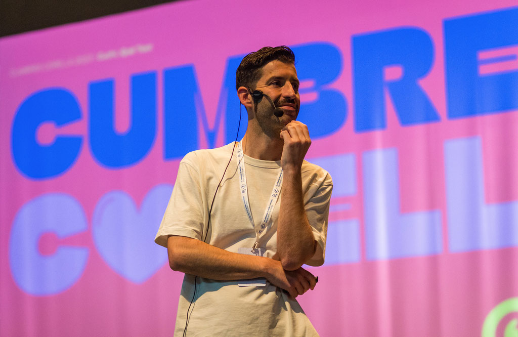
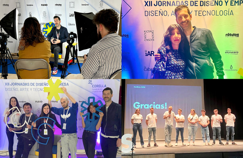
Cumbres Corella
April, 2023
So glad to be part in "Cumbres Corella" design conferences, organized by the EASDi Corella (Navarra), among others great designers like Fyero Studio, WellDone Comunication or Pepe Gimeno! Very grateful, and congratulations to the organization (especially the students, we had a great time there). I hope see you soon! (click on each image to see it larger)
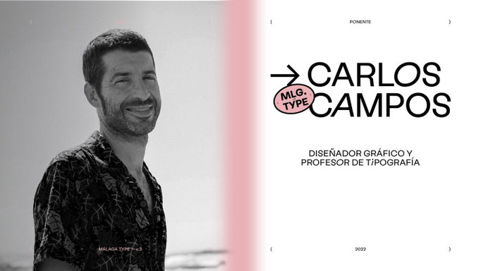
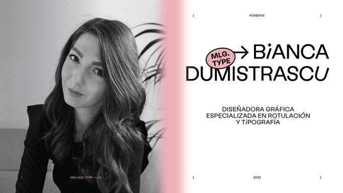
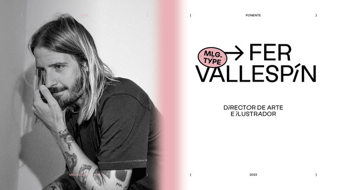
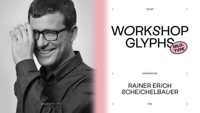
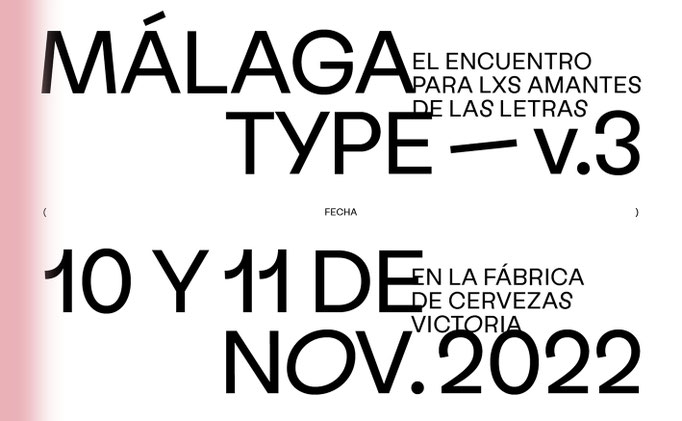
Málaga Type v.3
November, 2022
For the third time, lovers of typography and editorial design had an unmissable date at the Victoria Beer Factory. Málaga Type 2022 ocurred on November 10 and 11. On thursday there was a Glyphsapp workshop, taught by Rainer Scheichelbauer. And on Friday, the conferences took place. We enjoyed the talent and knowledge of Fer Vallespín, Bianca Dumitrascu and me; Carlos Campos! (Cuchi, qué Tipo) (click on each image to see it larger).
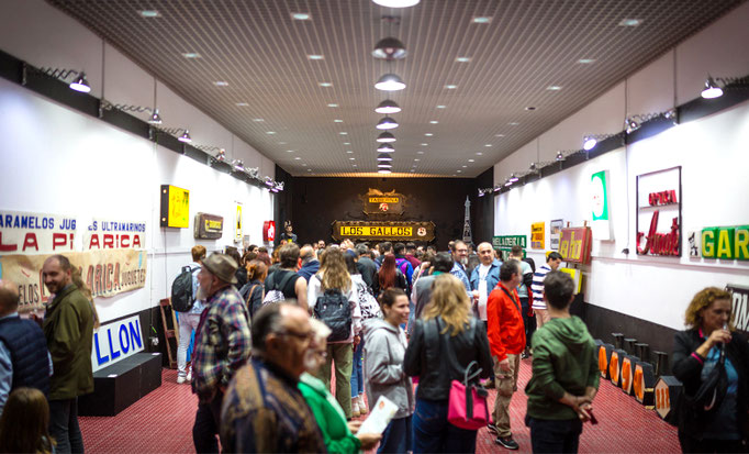
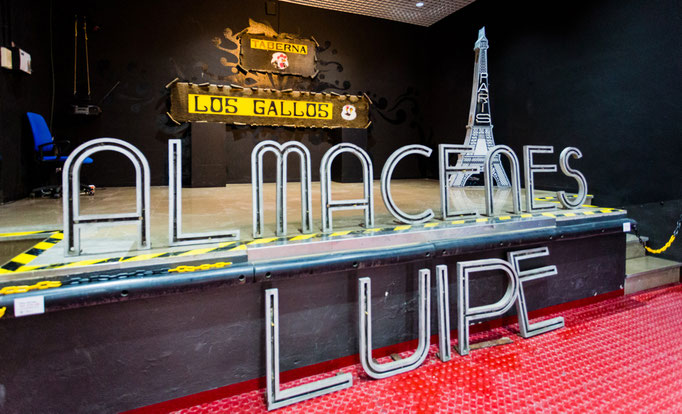
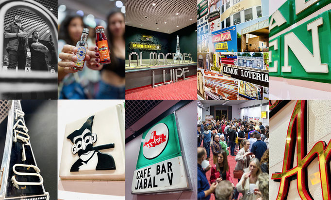
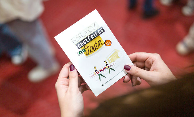
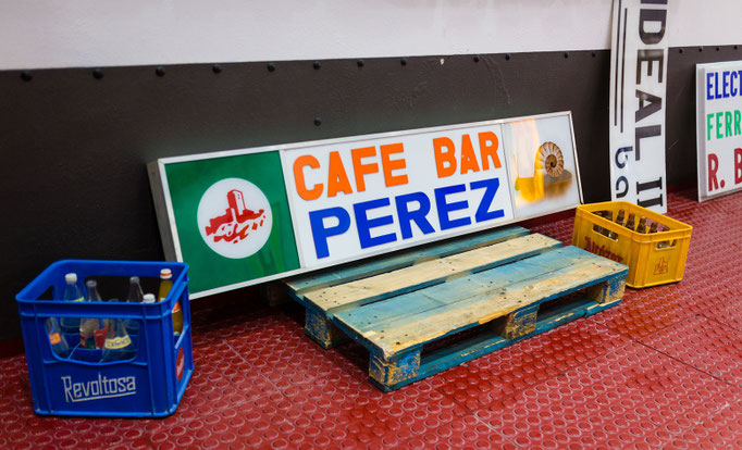
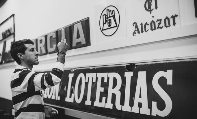
Rótulos Chuléricos Jaén - The exhibition
November, 2022
The exhibition Rótulos Chuléricos de Jaén/Supercool lettersigns from Jaén has taken place in the Moneo Building (former Bank of Spain). From the 3rd to the 26th of November, it will host a show which you can see a large part of the signs that Juan Montoro "El Creata" and Carlos Campos "Cuchi, qué Tipo" have rescued during two years of saving pieces of graphic heritage of the city of Jaén (click on each image to see it larger).


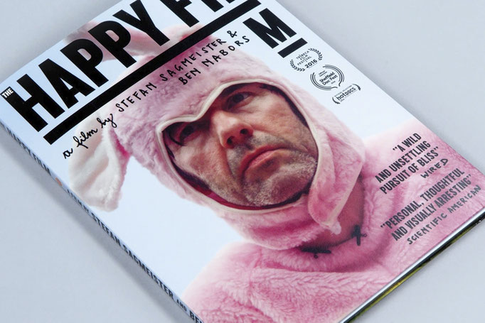
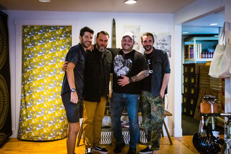
Stefan Sagmeister workshop
September, 2021
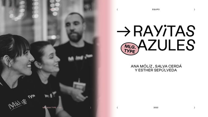
The last two days I have been lucky enough to assist the workshop “How to touch someone's heart with the design”, by Stefan Sagmeister, one of the most provocative and influential creatives of the last decades worldwide. Thousands of thanks to the team of Moments Festival 2021 for making it possible! See the full the interview I did Stefan for Rayitas Azules here! (click on each image to see it larger)


Chatting Andy Cruz (House Industries)
March, 2021
Founded in 1993, the mythical House Industries is a subversive design studio, a lover of metal and punk culture, cars and skateboards. It is specialized in typefaces and lettering work, and has a portfolio of such important clients such The New Yorker or J. J. Abrahams. We were with its founder Andy Cruz, and making him a few questions that you can see now in Rayitas Azules (click on the image to see it larger).
Typewknd 2020 speaking
January, 2021
A few months ago, I had the opportunity to speak at a fantastic free online global event: Typewknd. This talk is now available online. Thank you Typewknd for letting me be part of this great meeting! (click on each image to see it larger)
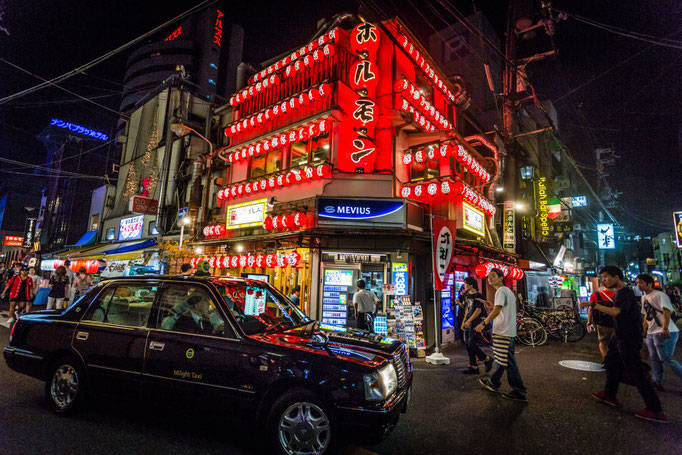
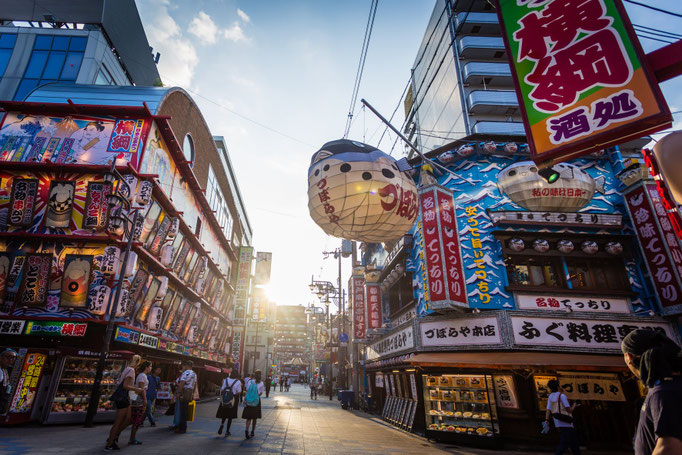
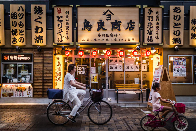
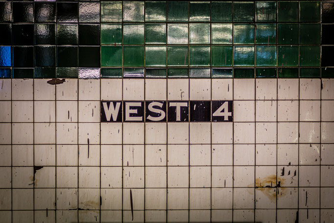
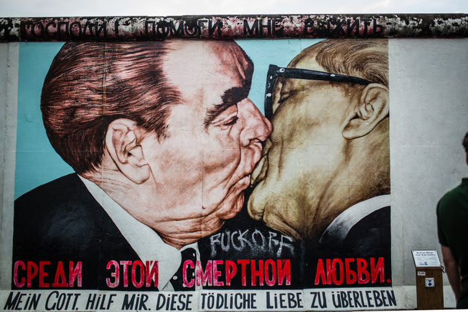
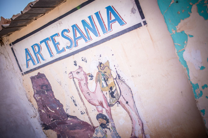
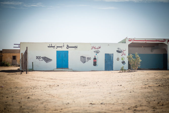
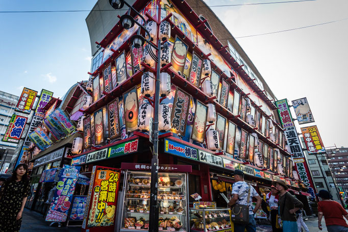
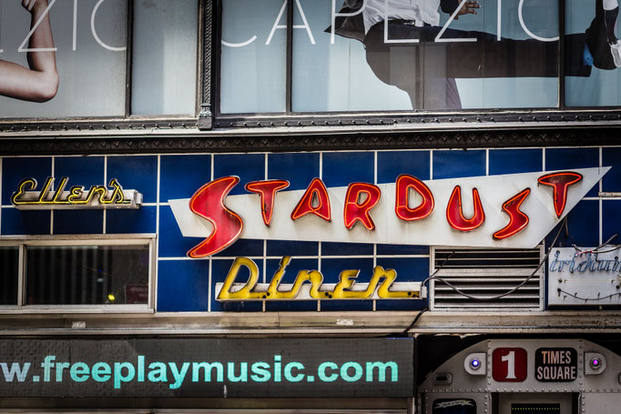
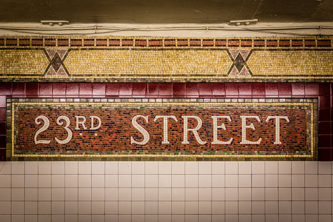
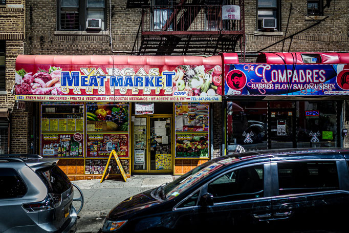
Letters from the world
June, 2020
This world is full of letters; all of them comunicate a textual content, but, also in addition, they are dressed in very different ways, which is why they add another message to that content, if possible even more powerful. Here are some examples. All the photos by Carlos Campos (Cuchi, qué tipo!) (click on each image to see it larger).


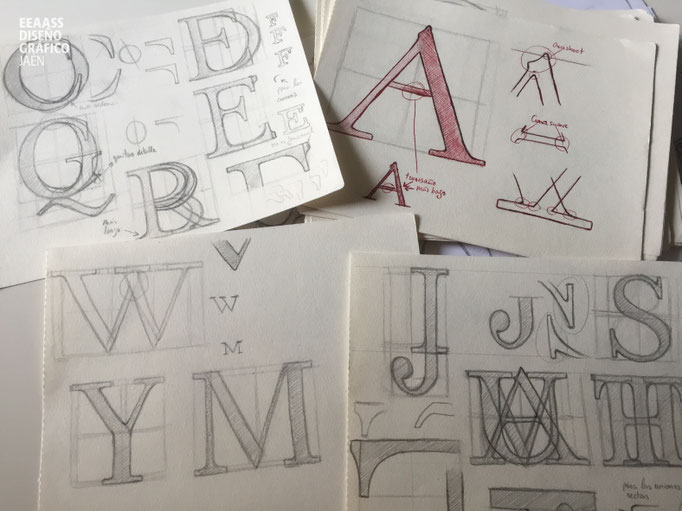
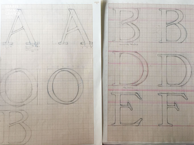
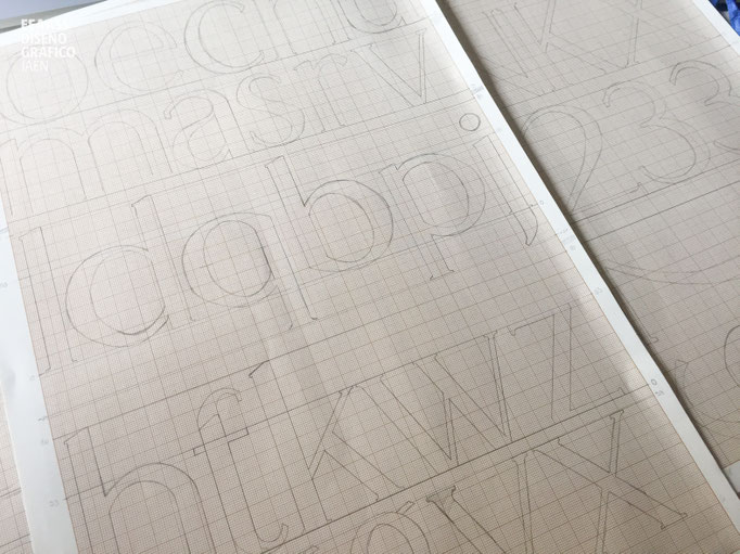
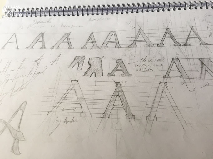
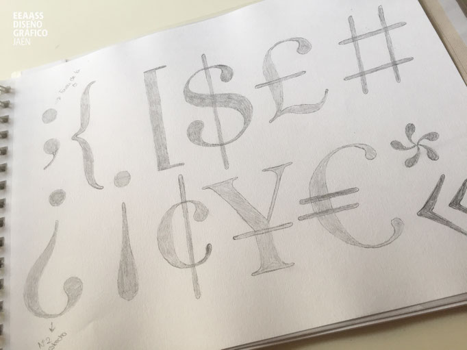
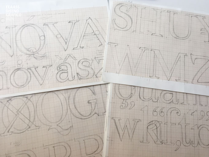
Typographic sketches
December, 2019
After the initial phase of analysis and inspirational research, the first sketches of the future typefaces of the 2nd EAS students are produced. They are only sketches, but they represent the starting point, which will end in a few months with a complete, valid and functional typeface for multiple projects. Congratulations! (click on each image to see it larger)


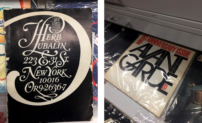
Herb Lubalin, the typography giant
November, 2019
Herb Lubalin (NYC, 1918 - 1981) revolutionized American advertising and editorial design in the second half of the 20th century. Fonts such as Avant Garde Gothic or Serif Gothic, the creation of the International Typeface Corporation (ITC) or the magazine U & lc (Upper and lower case), are some of its landmarks best known by the general public.
Keep reading on Rayitas Azules (click on each image to see it larger).


Órbitas Jaén© 2019
February, 2019
"Órbitas Jaén©, encuentro con creativos estelares / Orbitas, a meeting with stellar creatives" is an event created with the main objective of bringing to the city of Jaén (southern Spain) the biggest references of national creativity. We are glad to say that in the past editions, this event attracted to an audience of 400 people maximum. Thanks to those who has made it possible: the students of Enseñanzas Artísticas Superiores de Diseño Gráfico! (click on each image to see it larger).