
In this section there are some typefaces designed by me. All of them are original and with a very unique and genuine personality. You can be sure that if you use some of his typefaces, people will say "Cuchi!"
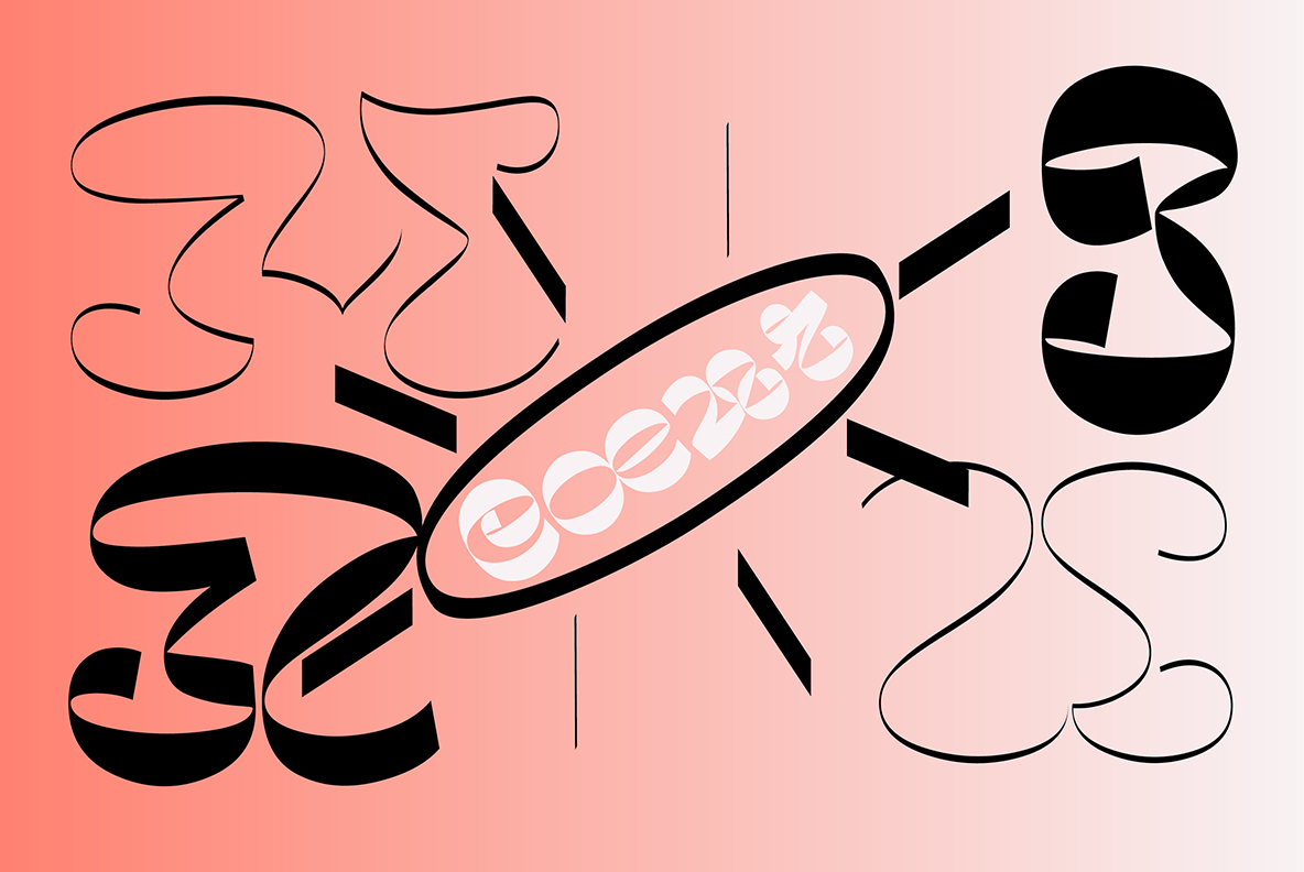
Betamax
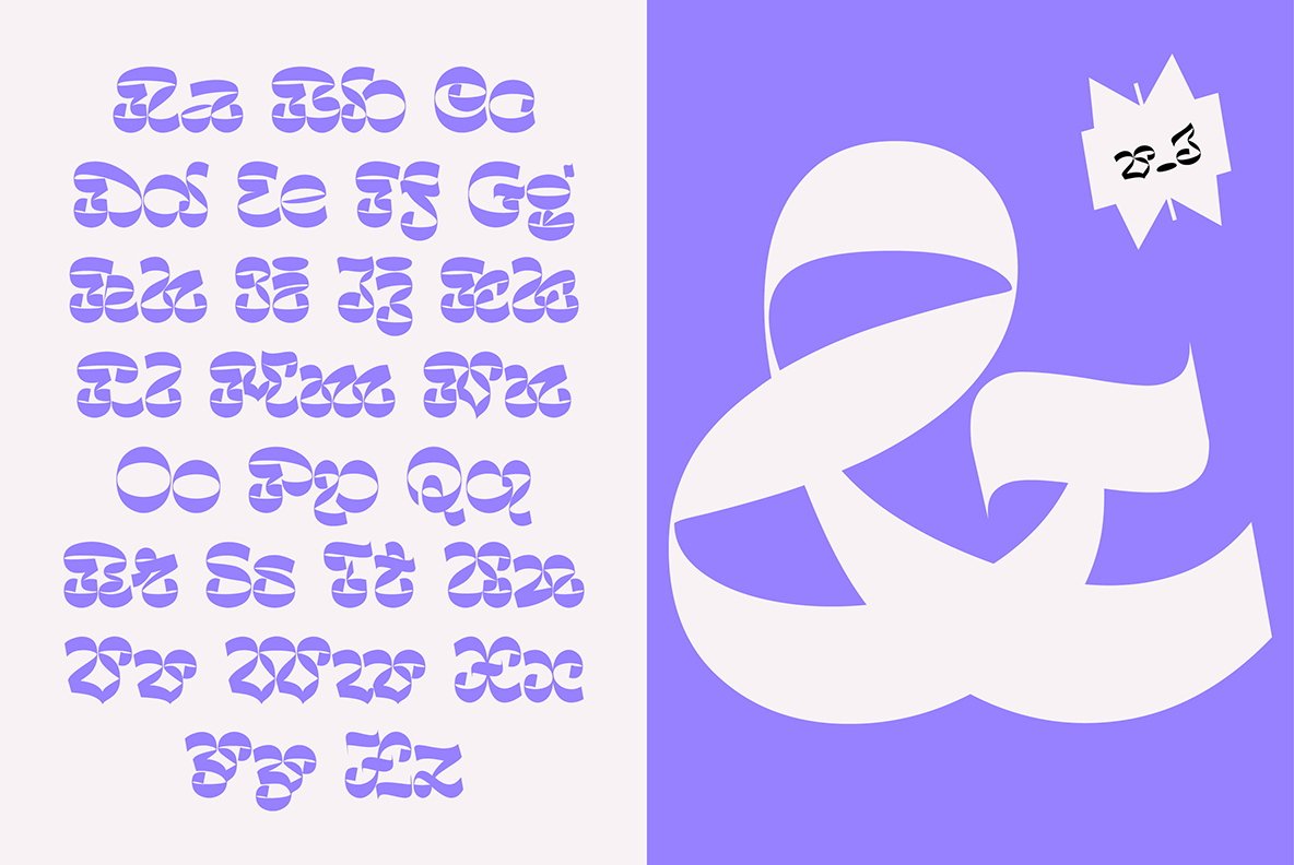
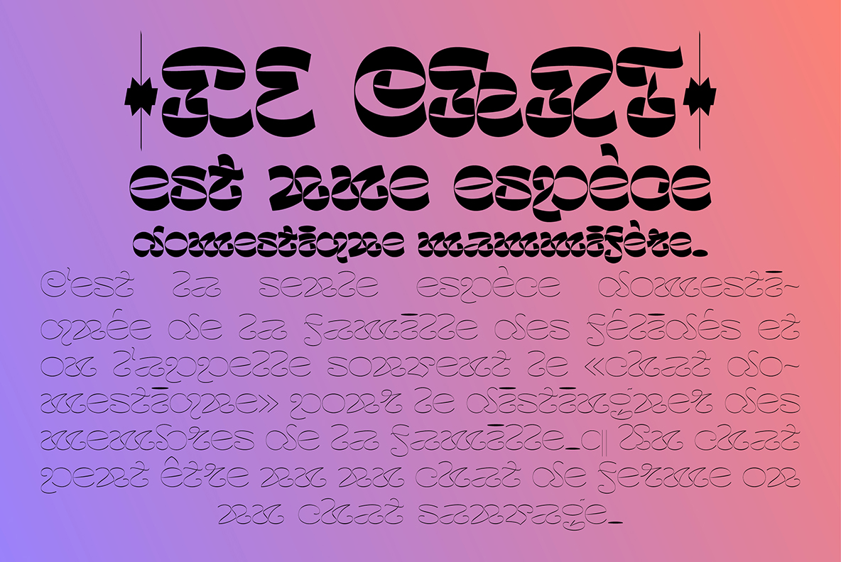
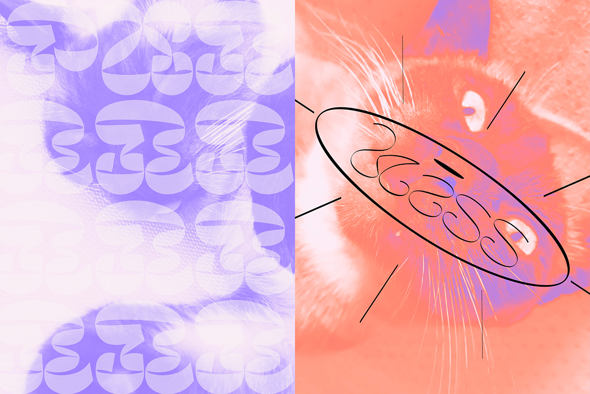
Cuchi qué Tipo, 2026
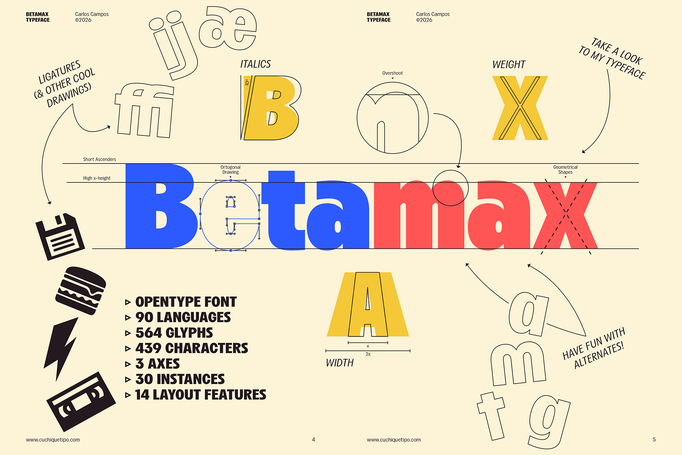
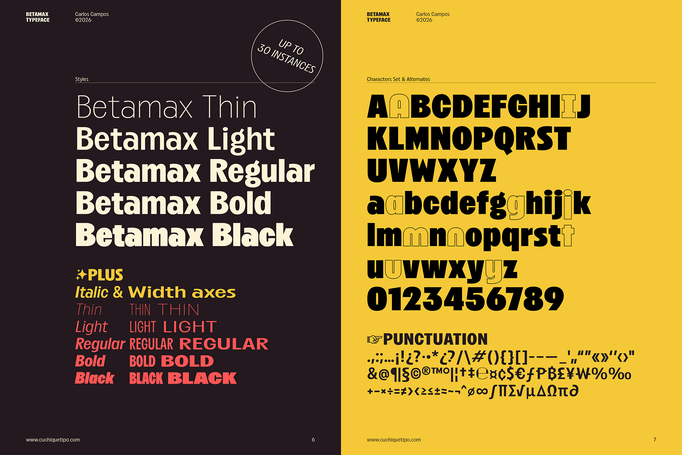
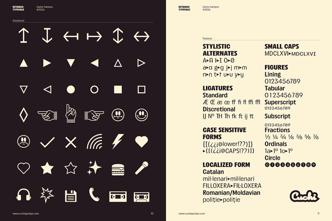
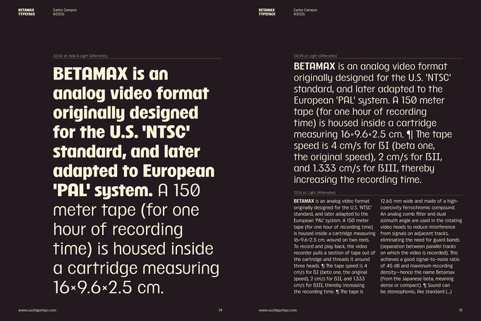
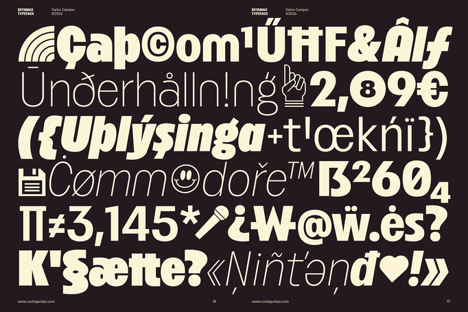
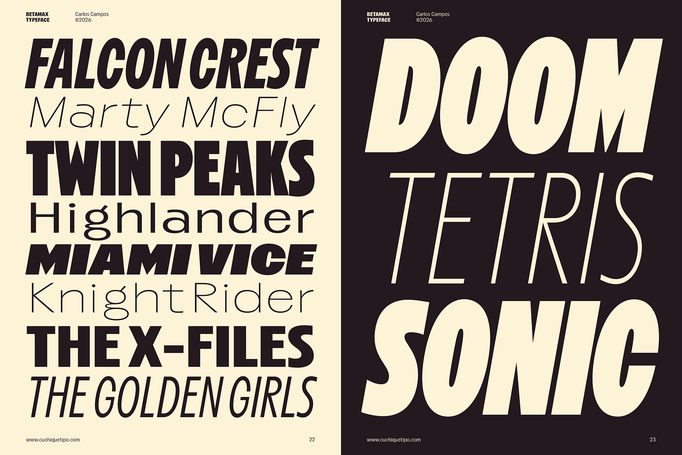
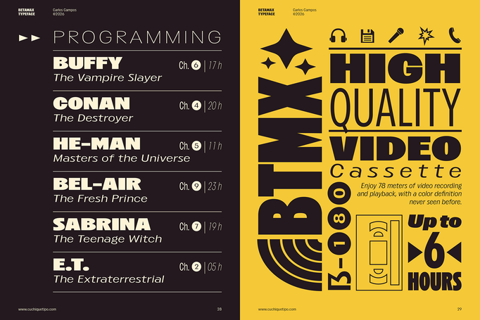
'BETAMAX' TYPEFACE is a design that rewinds you straight back to the era of VHS, arcades, and analog pop culture. Although it is a typeface inspired by late 20th-century technology, it is a recent creation with no formal connection to the historic video format that gives it its name. The aesthetic of Betamax blends nostalgia and freshness, making it ideal for projects that want a recognizable pop retro wink. Just like the arcade games of the 80s: "BETAMAX, GET READY TO PLAY!" (click on each image to see it larger).


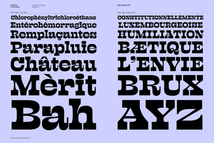
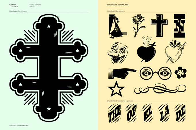
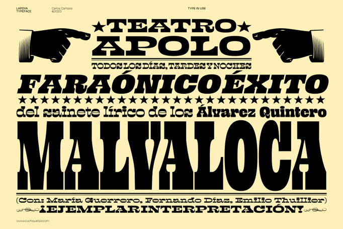
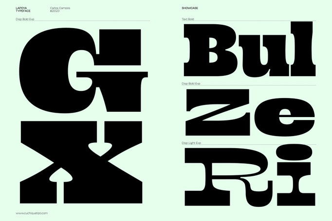
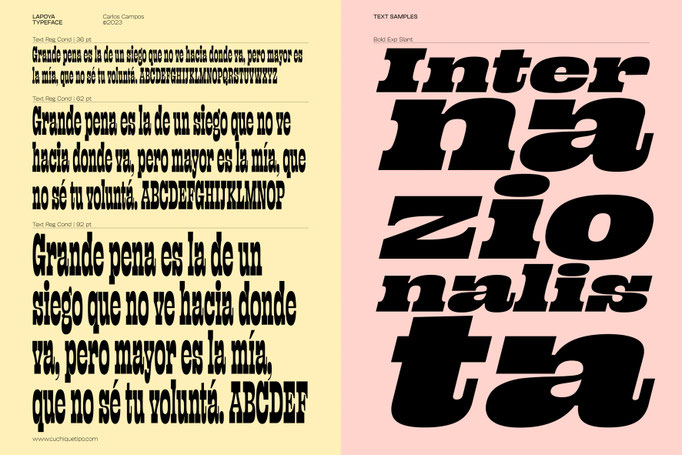
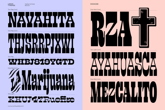
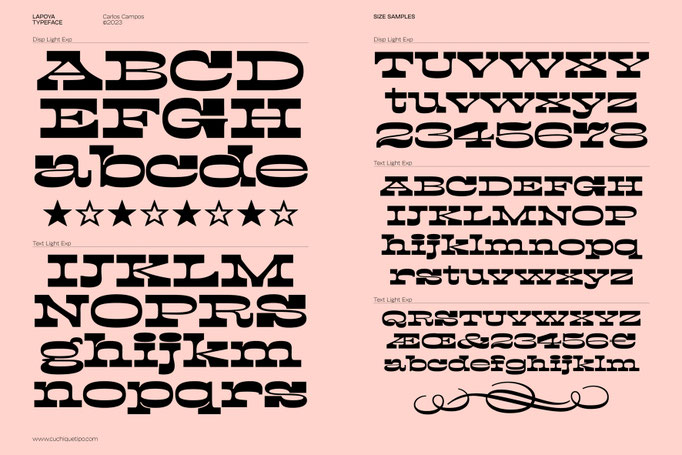
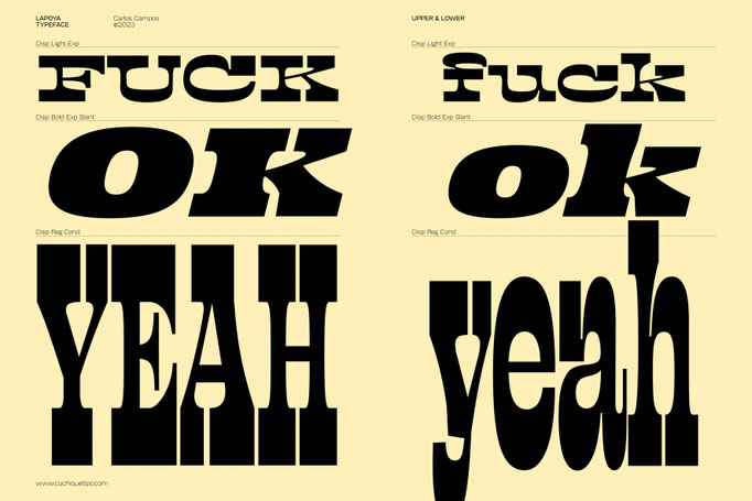
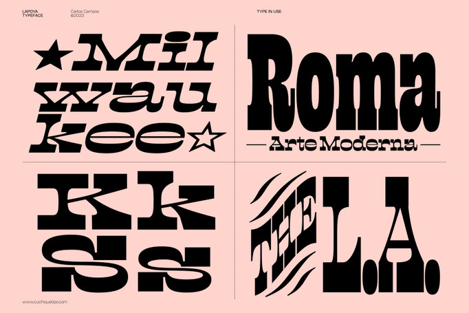
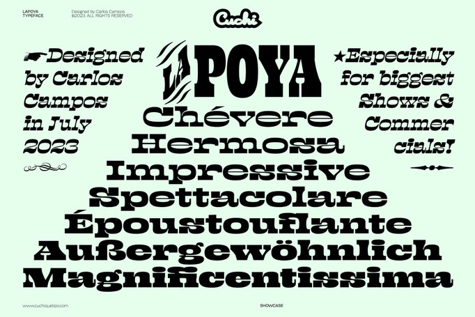
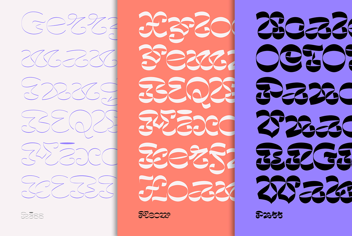
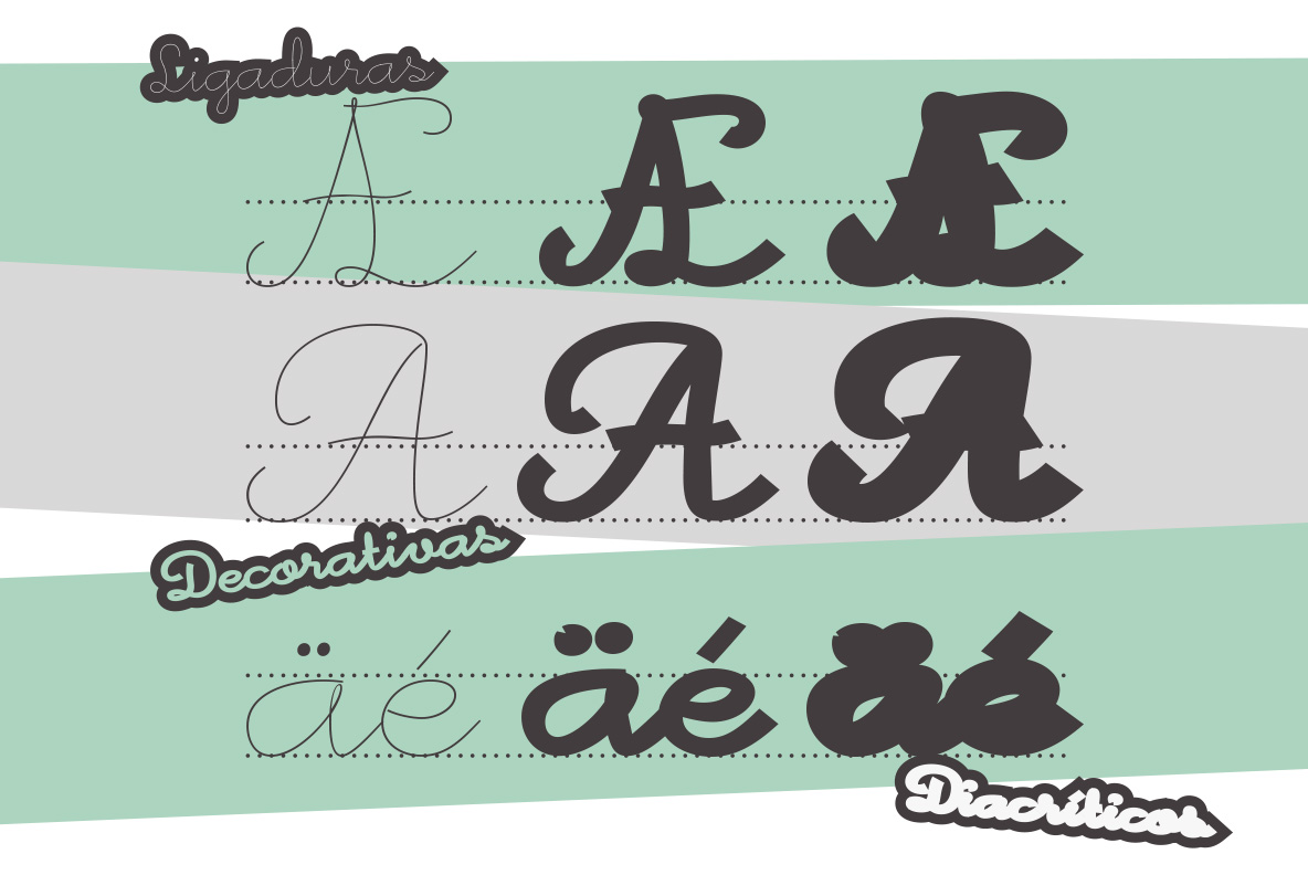
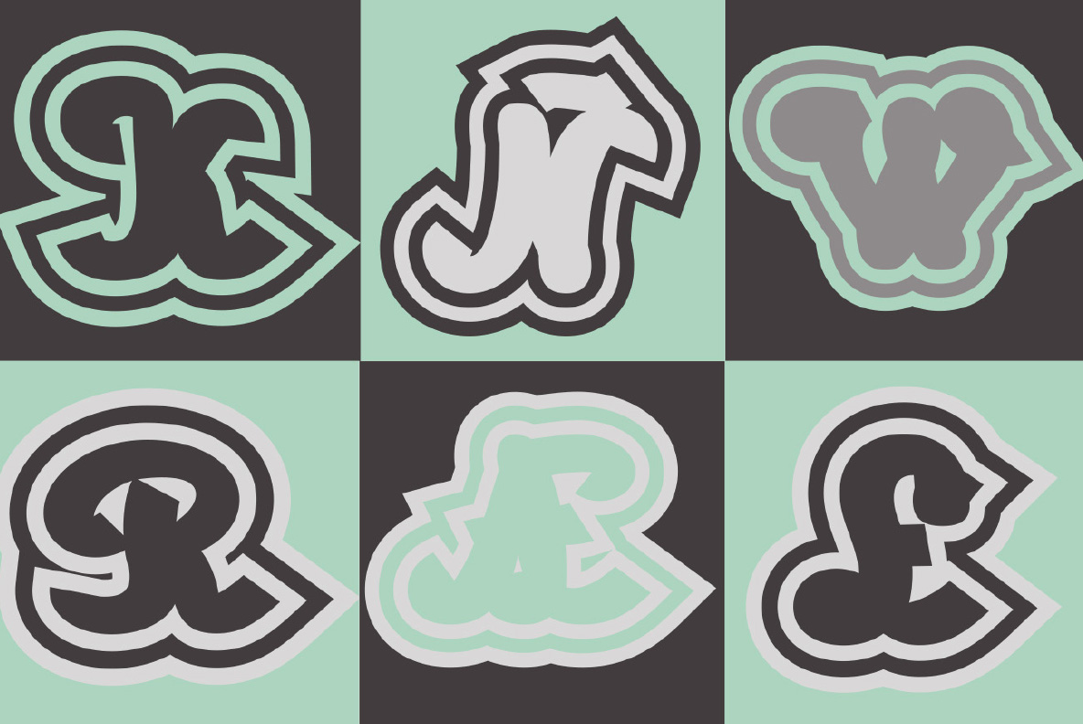
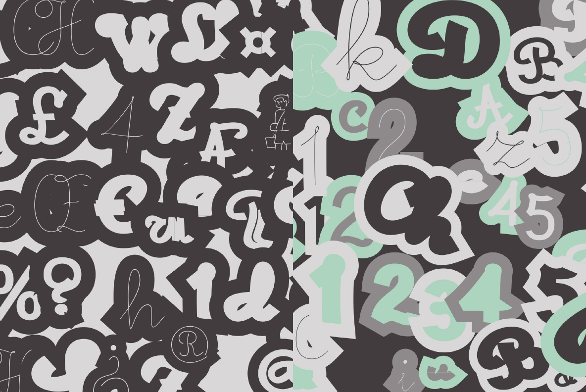
Lapoya
Cuchi qué Tipo, 2023
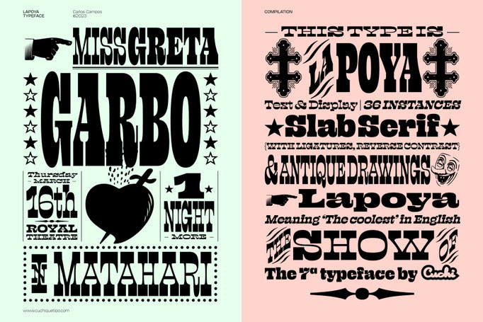
“LAPOYA” (meaning in english “the coolest”) is a large slab serif typeface family, with a certain Italian inverted contrast touch. Specially designed for advertising big shows and commerces, Lapoya has 36 variables and four axes, including a text and decorative versions, where the drawing and width of its counterforms vary. It also has icons that remember the old aesthetics of wood types from the early 20th century, and more than 400 characters with a multitude of signs and ligatures, that make Lapoya ideal for up to 89 languages. That’s why this type is LAPOYA! (click on each image to see it larger).


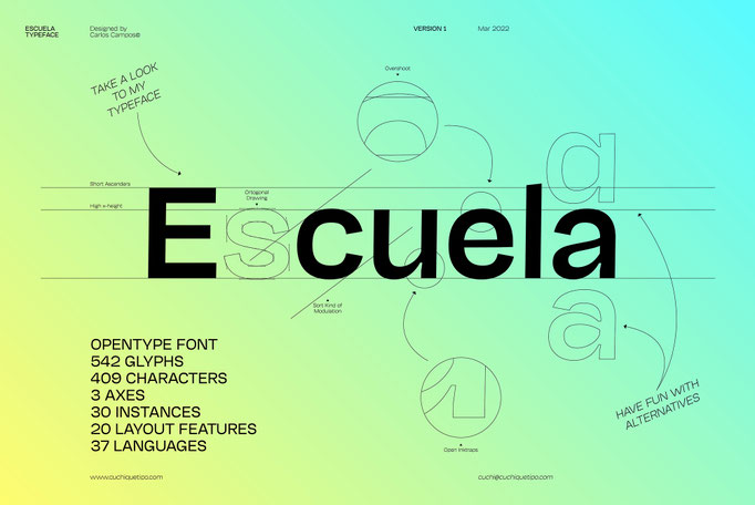
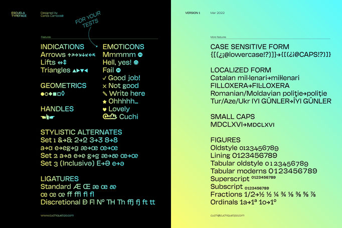
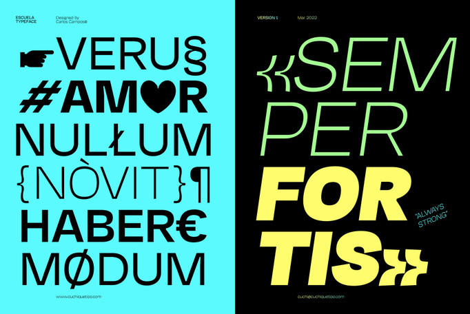
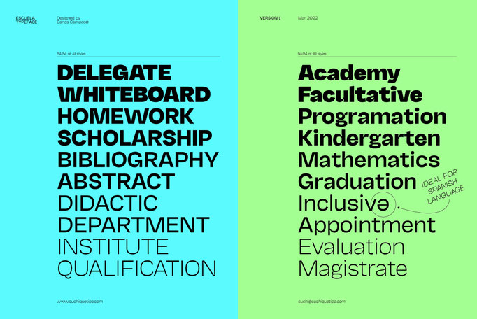
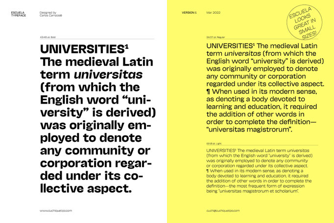
Escuela
Cuchi qué Tipo, 2022
Escuela typeface (meaning “School” in English) is born in an attempt to reflect so many current influences of modern grotesque fonts that are trying to better reflect the values of today's world; Escuela can be striking and ideal for headlines in large text and heavy weights, but at the same time serious and readable in smaller bodies or regular and fine weights. For this reason, Escuela is your best ally when it comes to preparing texts that transcend students through a contemporary and different, but functional, character (click on each image to see it larger).


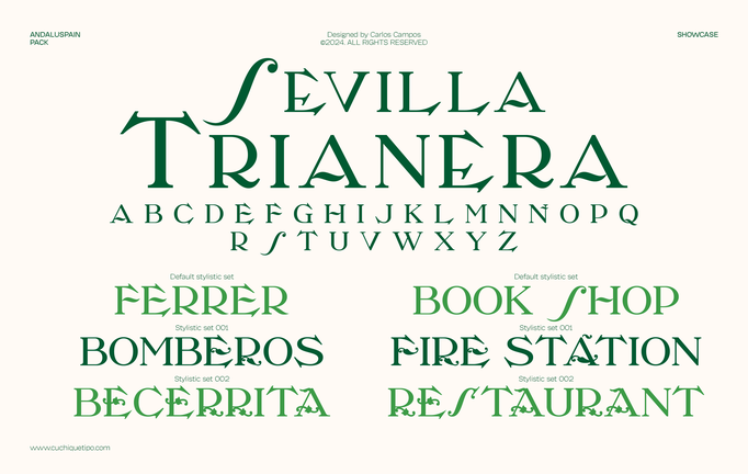
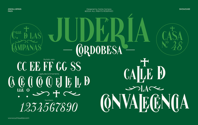
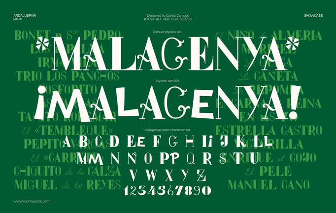
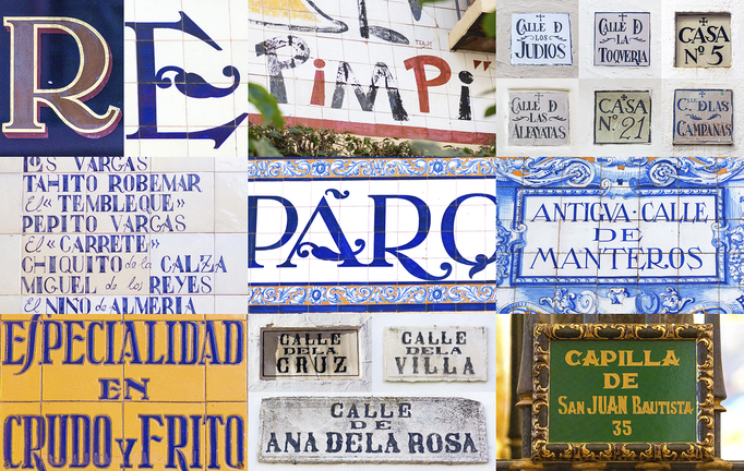
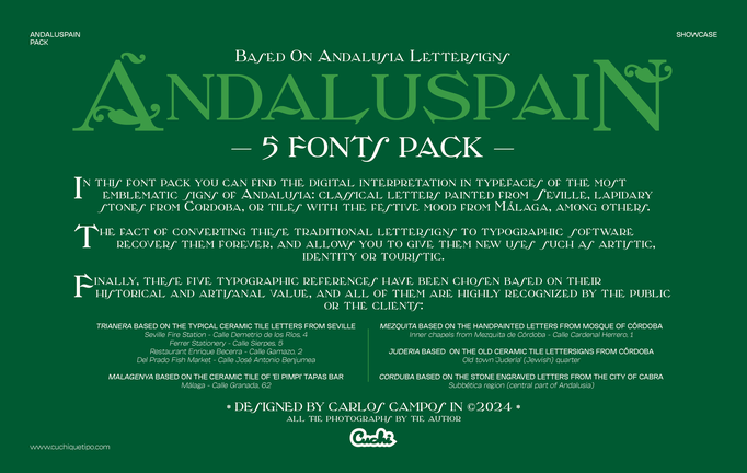
Andaluspain Pack
Cuchi qué Tipo, 2024
In this project you can find the digital interpretation in five typefaces of the most emblematic signs of Andalusia: classical letters painted from Seville, lapidary carved in stones from Cordoba, or tiles with the festive mood from Malaga, among others. The fact of converting these traditional lettersigns to typographic software recovers them forever, and allows you to give them new uses. You can see it animated here (click on each image to see it larger).


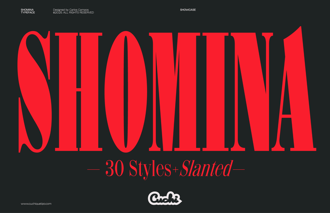
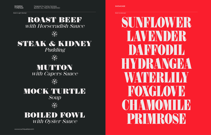
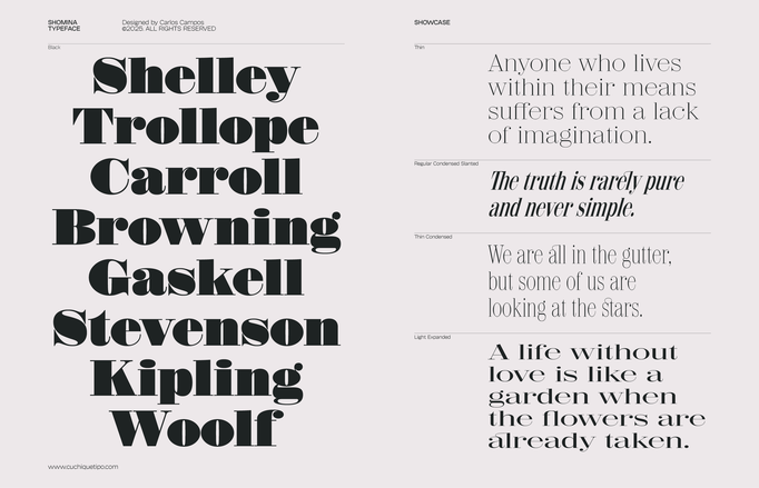
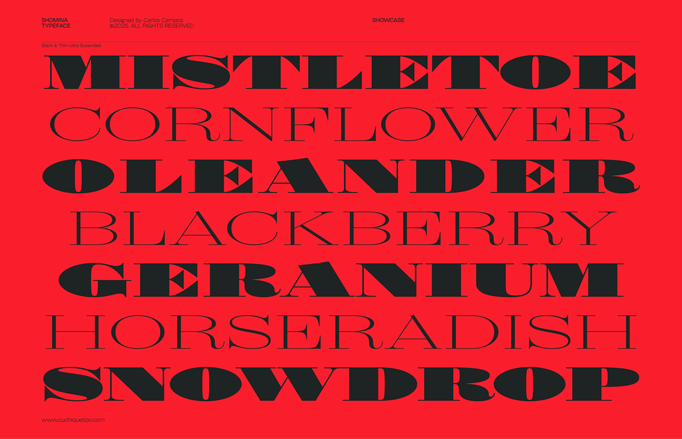
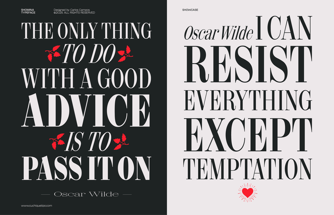
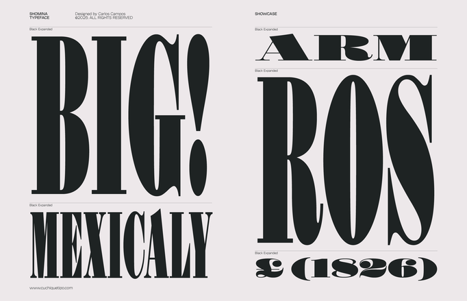
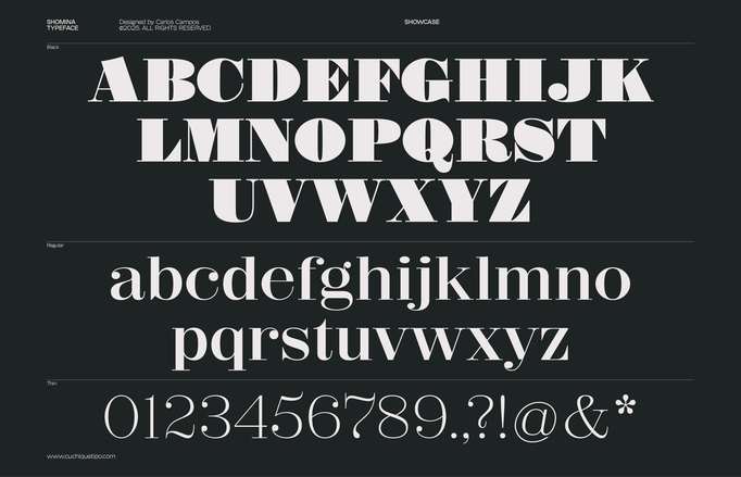
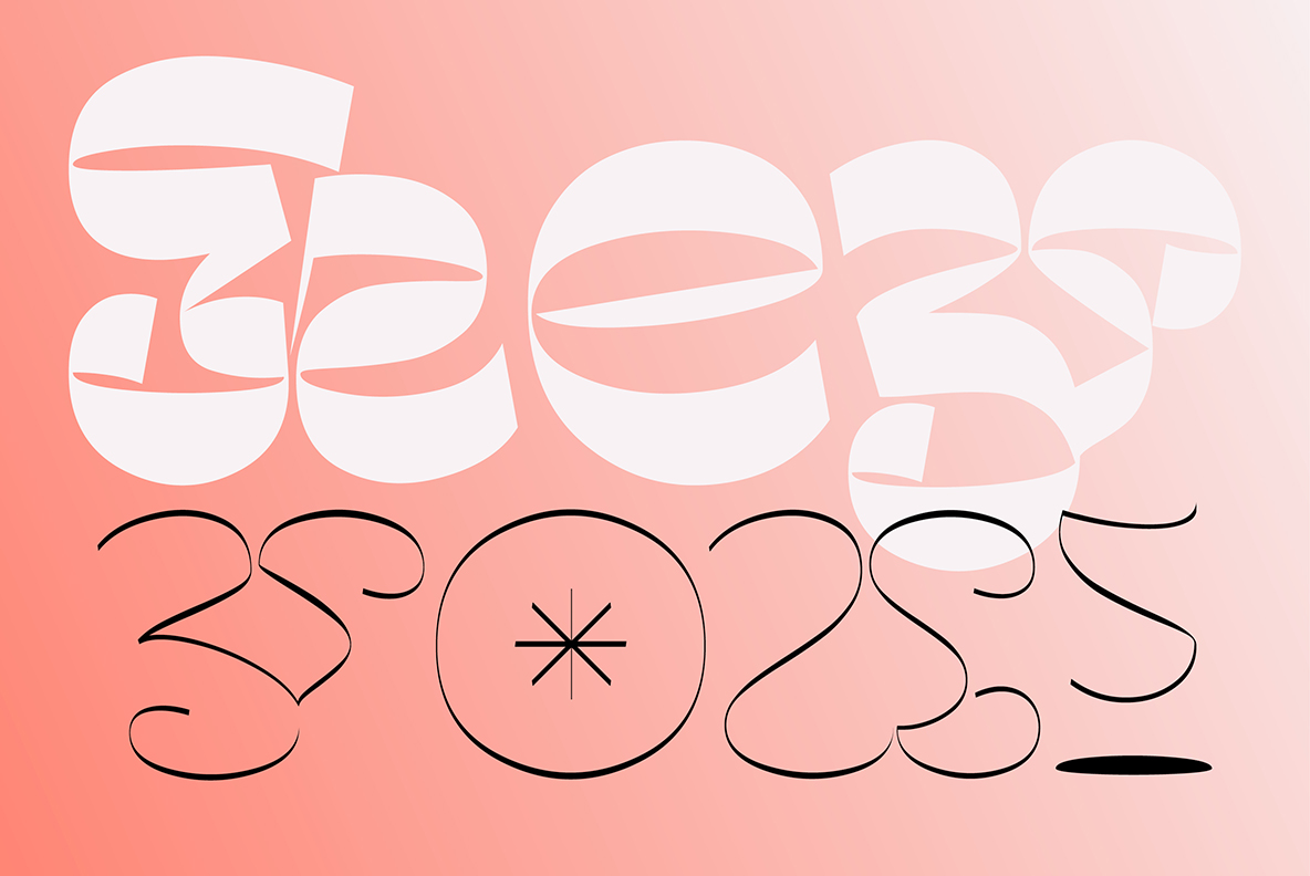
Shomina
Cuchi qué Tipo, 2025
Allow me to present you the specimen of my newly crafted typeface: SHOMINA! A creation inspired by the timeless forms of the Didone style, that emerges from the harmonious confluence of traditional elegance and modern refinement. Shomina offers thirty distinct weights (plus the slanted variants), allowing every designer to tailor its appearance to their precise specifications. I’m sure you shall find Shomina an indispensable addition to your typographic repertoire! (click on each image to see it larger).


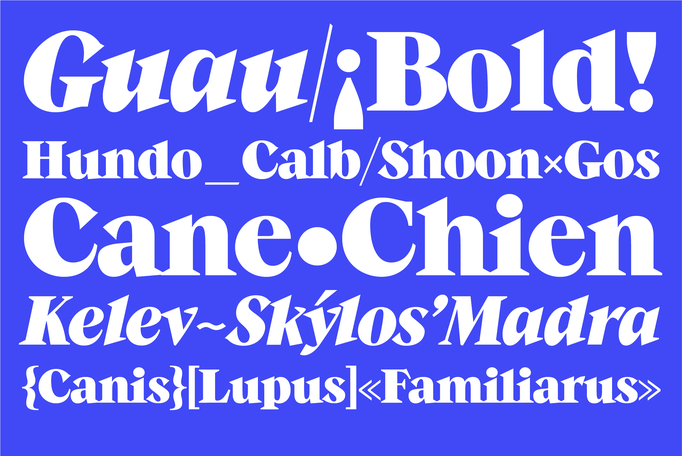
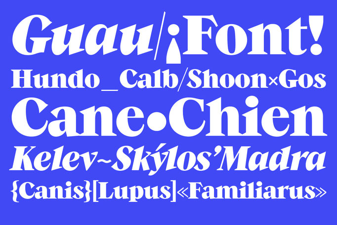
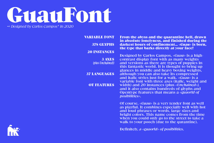
Guau!
Cuchi qué Tipo, 2020
Guau! is born, the type that barks directly at your face! Designed by Carlos Campos, Guau is a highly-contrast display font with as many weights and versions as there are types of puppies in this fantastic world. It is thought to bring up glances in middle and heavy boxing weights, although you can also take its compressed and italic styles just for a walk. Guau is a variable font with three axes (italic, weight and width) and 20 instances, and it also contains thousands of glyphs and Opentype features that means a "guaorld of posibilities". Definitely, Guau is your new best friend! You can see it animated here (click on each image to see it larger).


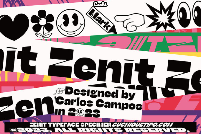
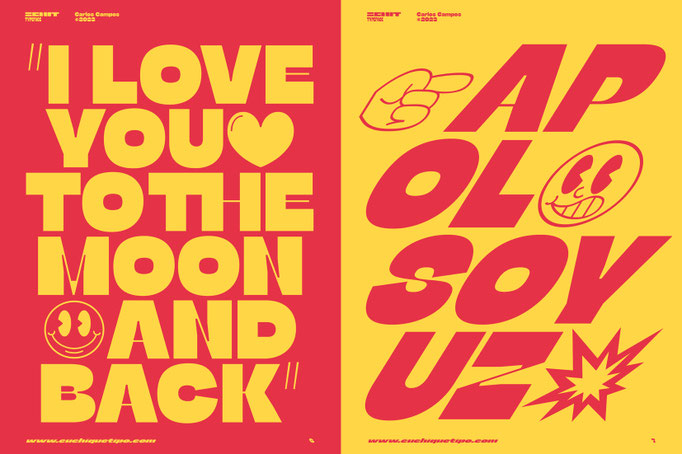
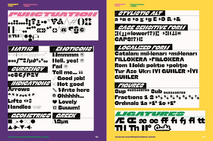
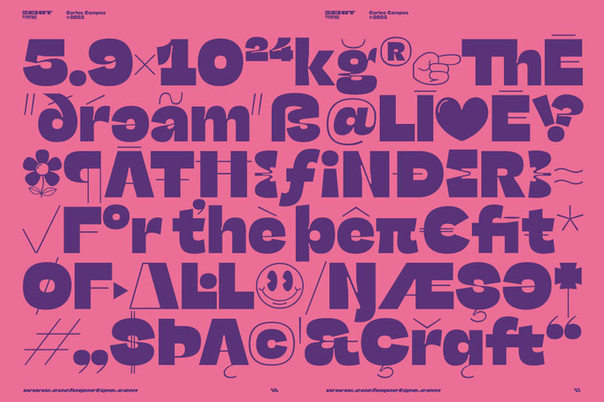
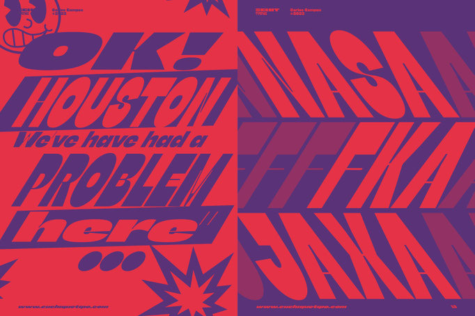
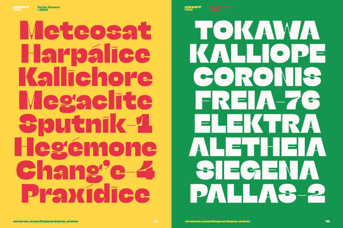
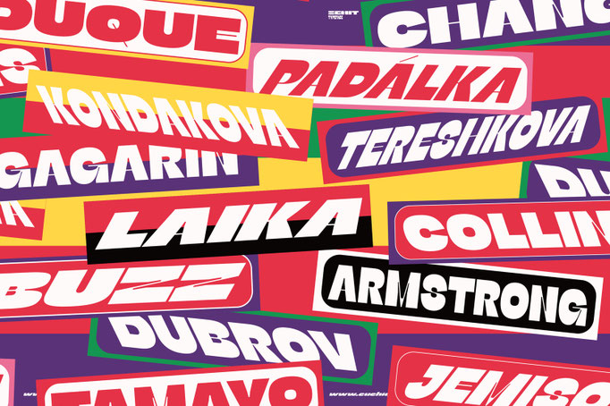
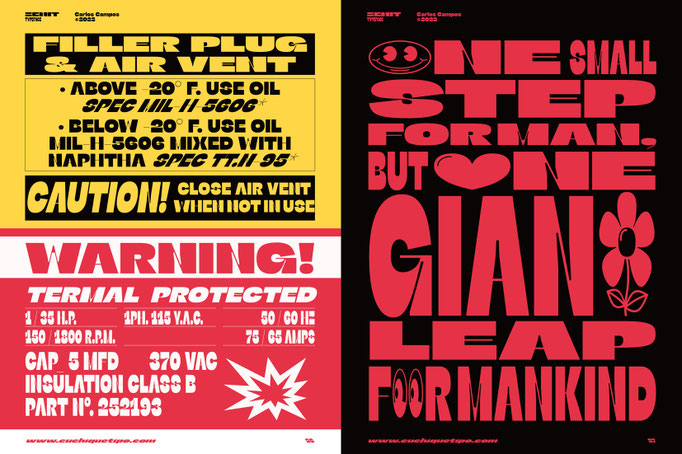
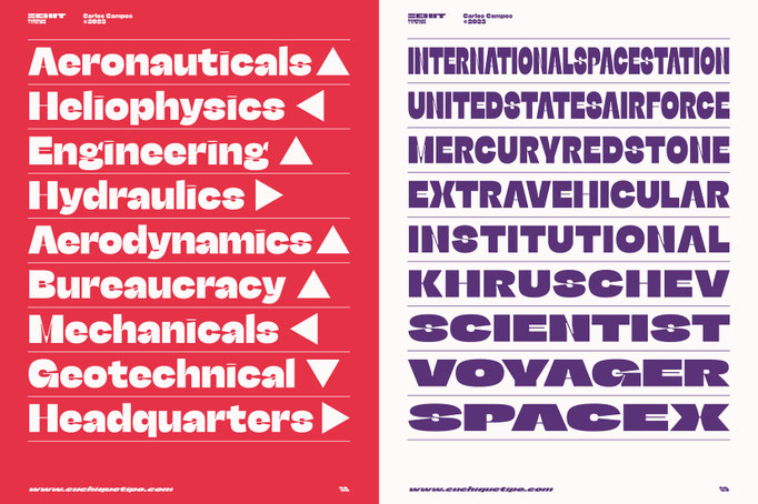
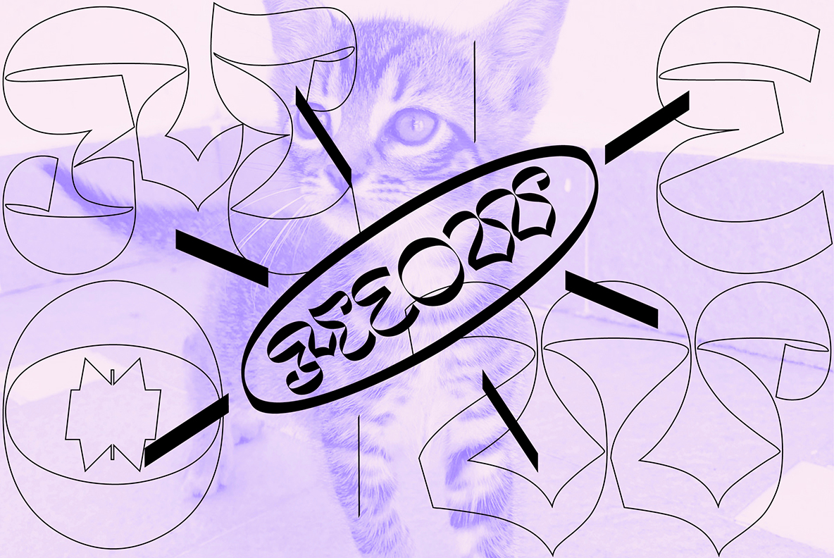
Zenit
Cuchi qué Tipo, 2023
As "Zenith" means, in an astronomical context, the highest point reached by a celestial body, my new typeface raises its drawing for carry it to the highest expression. In an effort to design a singular graphic and visual letters system, the contrasts and proportions of “Zenit” boosts up and are squeezed as much as possible, resulting in a very particular aesthetic. Given its daring and futuristic style, “Zenit” is an ideal typeface for use in designs that want to discover new, still unexplored, space worlds, as the great event Órbitas 2023! Zenit, the typeface that rockets you! You can see it animated here (click on each image to see it larger).


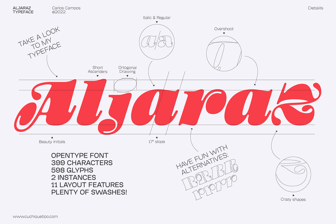
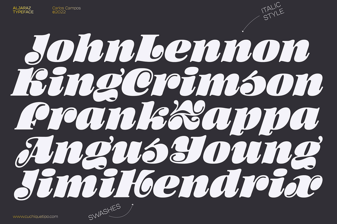
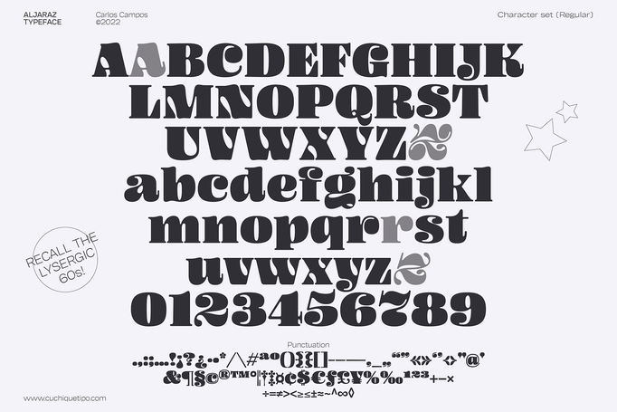
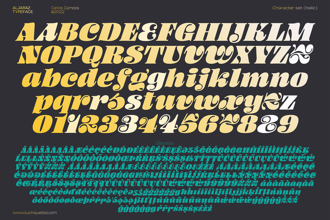
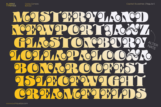
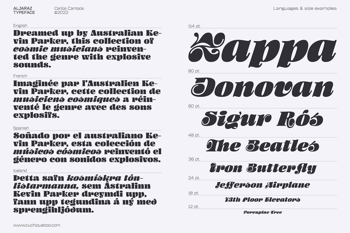
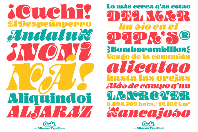
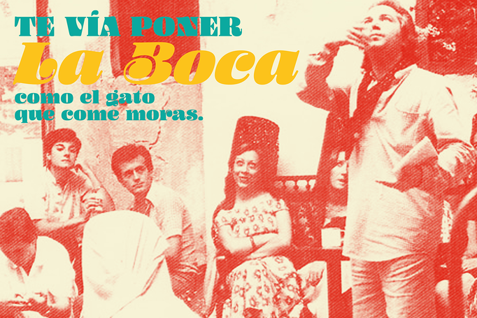
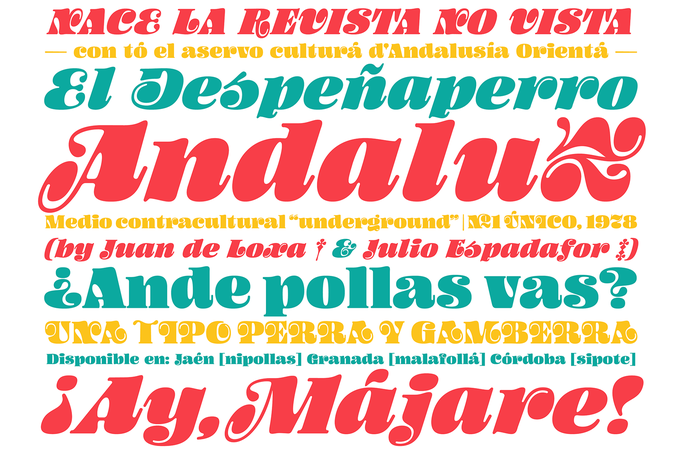
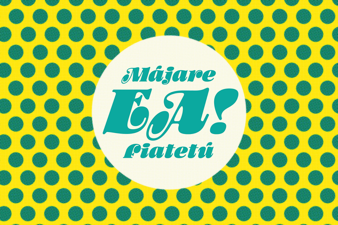
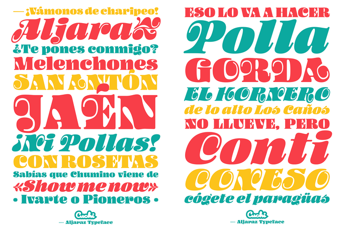
Aljaraz
Cuchi qué Tipo, 2022
Aljaraz (meaning “small bell” in english) is a curvy typeface inspired on the “Fat face" letters with an extremely bold design from the early 19th century, but with an insolent touch of brave and psychedelic distortions. Aljaraz has a regular and italic variable, and in both styles the capital letters have a swash alternative where the naughty touch reaches its maximum expression. It is ideal to recall the lysergic era of the 60s, write funny words, or simply to express small texts in a display way that powerfully attracts attention. You can see it animated here (click on each image to see it larger).


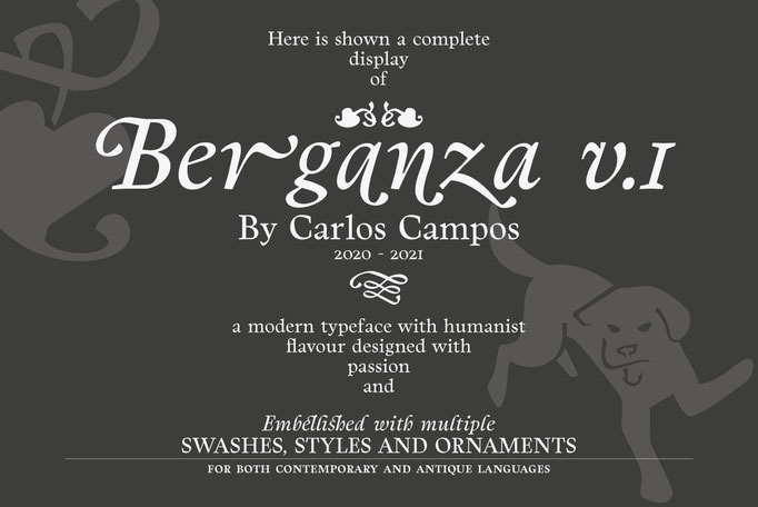
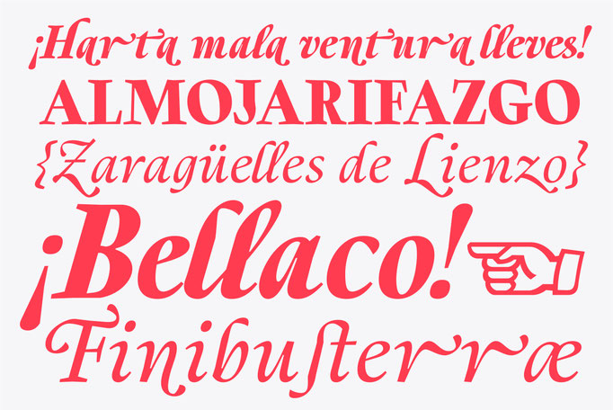
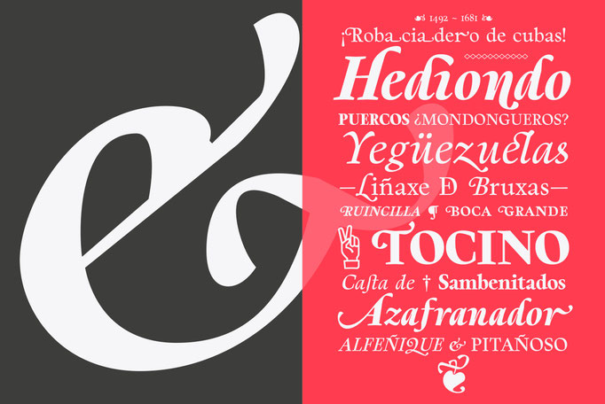
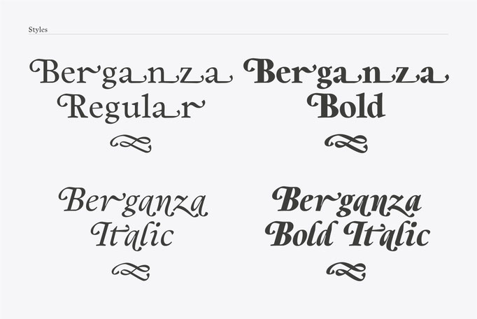
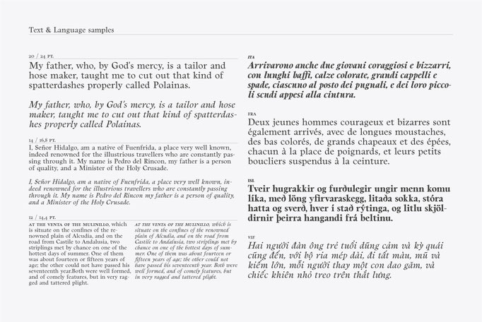
Berganza
Cuchi qué Tipo, 2021
Berganza is a typeface designed as a tribute to the spanish century called Siglo de Oro. Embellished with several ornaments and swashes, it quickly reminds an age in which castilian arts & letters were flourished, as well as the fantasy knighty fables adventures of heroes, loved ladies and evil villains. Thanks to its various styles and flourishes, it immediately refers to the aesthetic of that time. But also, Berganza takes advantage of the contemporary technology, highlighting in his drawing the contrasted forms and unusual strokes in order to give it a brave style touch. You can see it animated here (click on each image to see it larger).


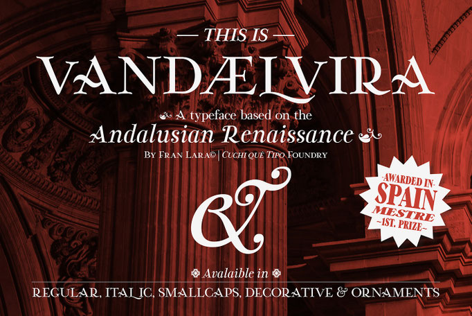
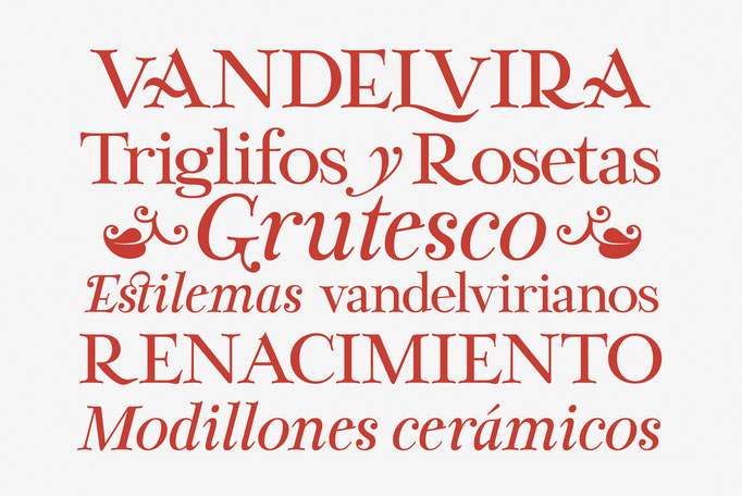
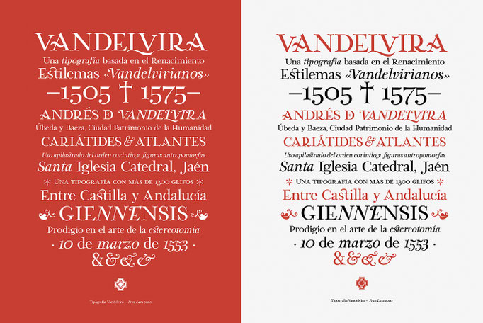
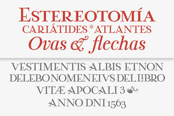
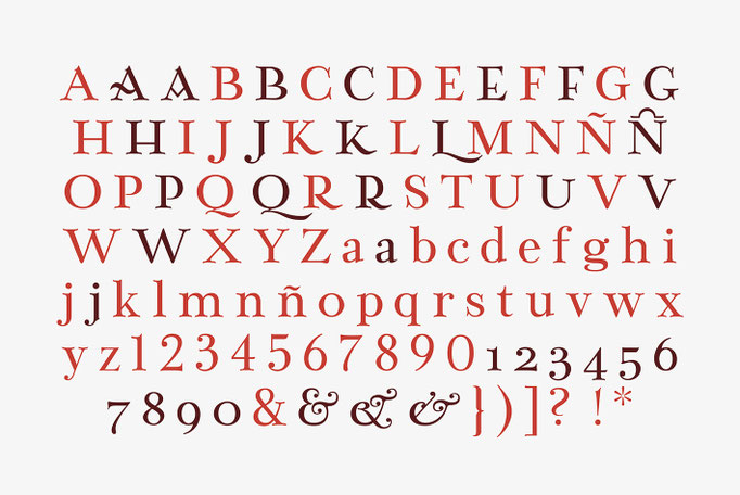
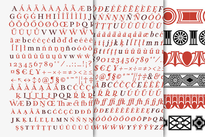
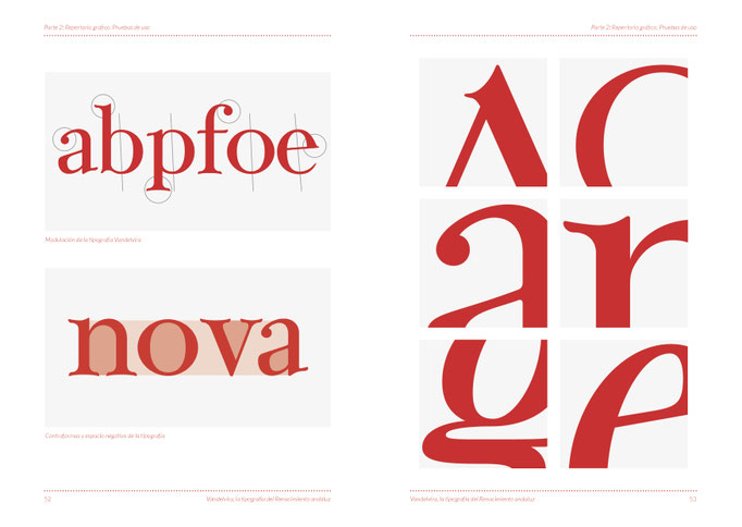
Vandelvira
Fran Lara, 2021
Vandelvira is a typographic project that delves into the historical legacy of the province of Jaén (northern Andalusia), aimed to spread the culture and tradition of this territory, based on one of its greatest artistic exponents: the architect Andrés de Vandelvira. In the forms and ornaments of these letters, the characteristics of his work during the 16th century are graphically reflected, and it serves as a memory and honor, as a historical legacy of this marvelous "genius loci" of the Spanish Renaissance. You cand find out more about Fran Lara in Behance (click on each image to see it larger).


Andaluspain 2
Cuchi qué Tipo, 2024


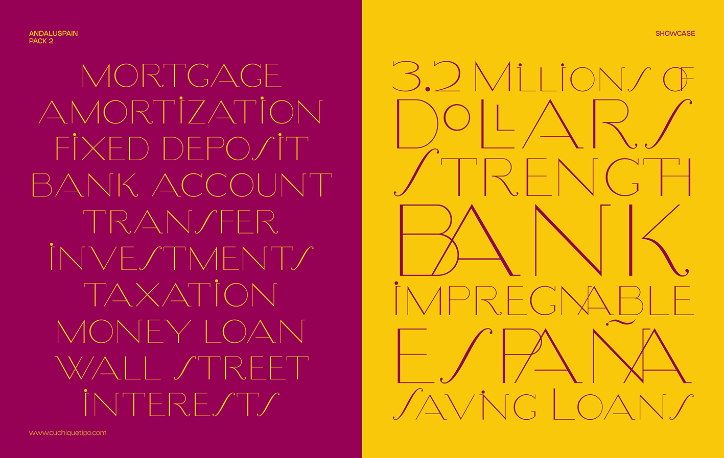
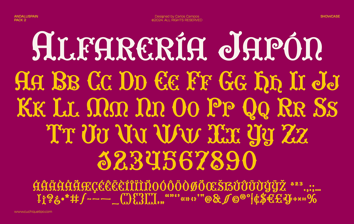
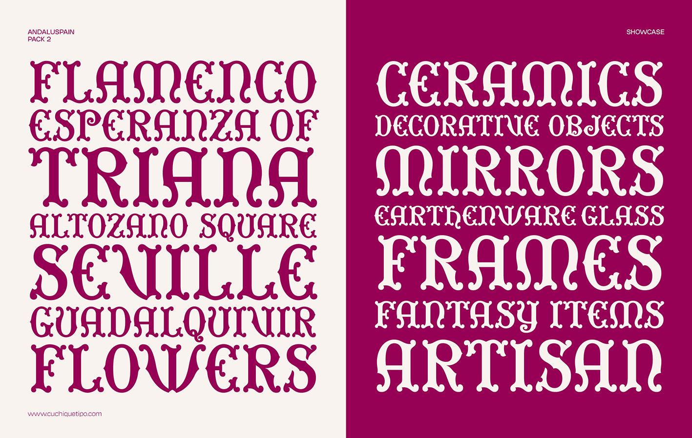

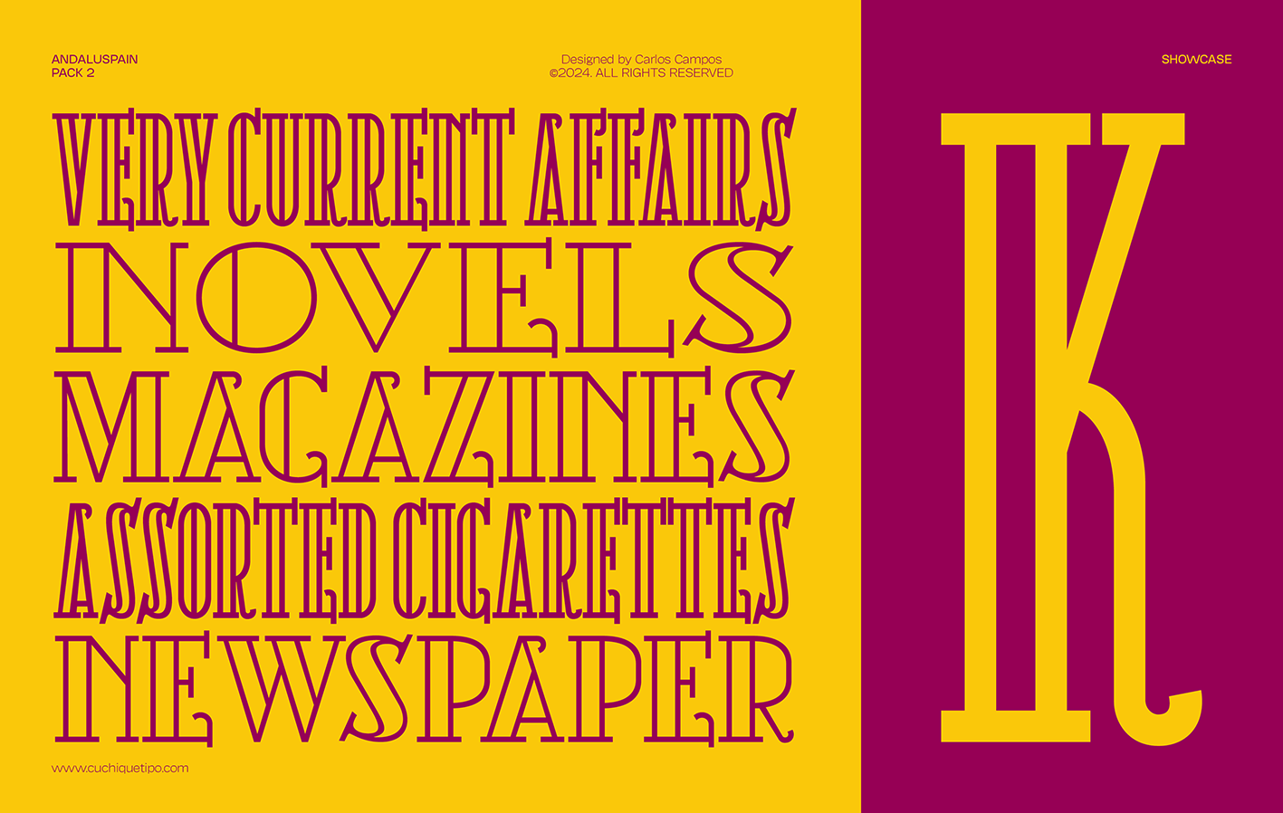
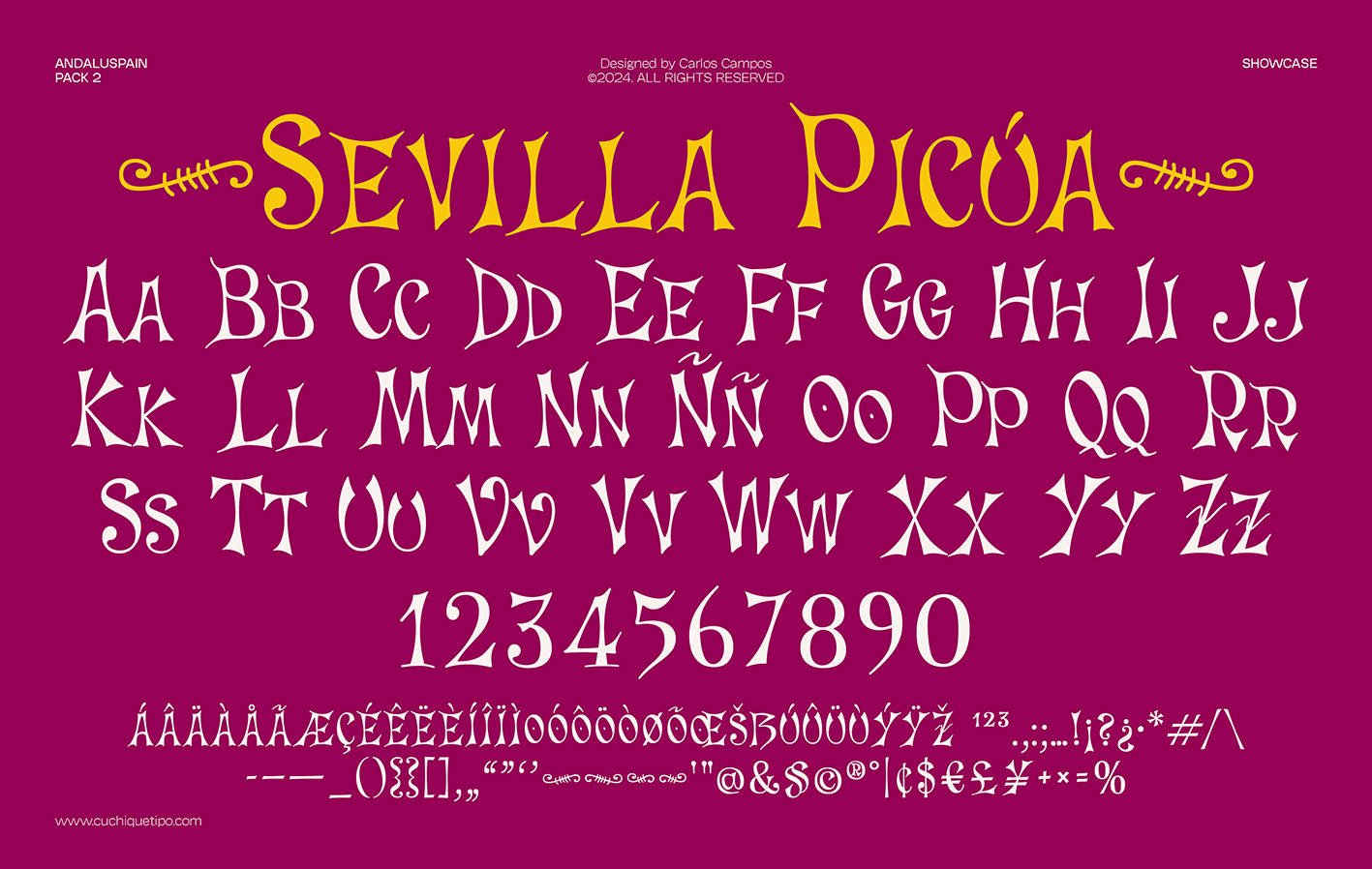
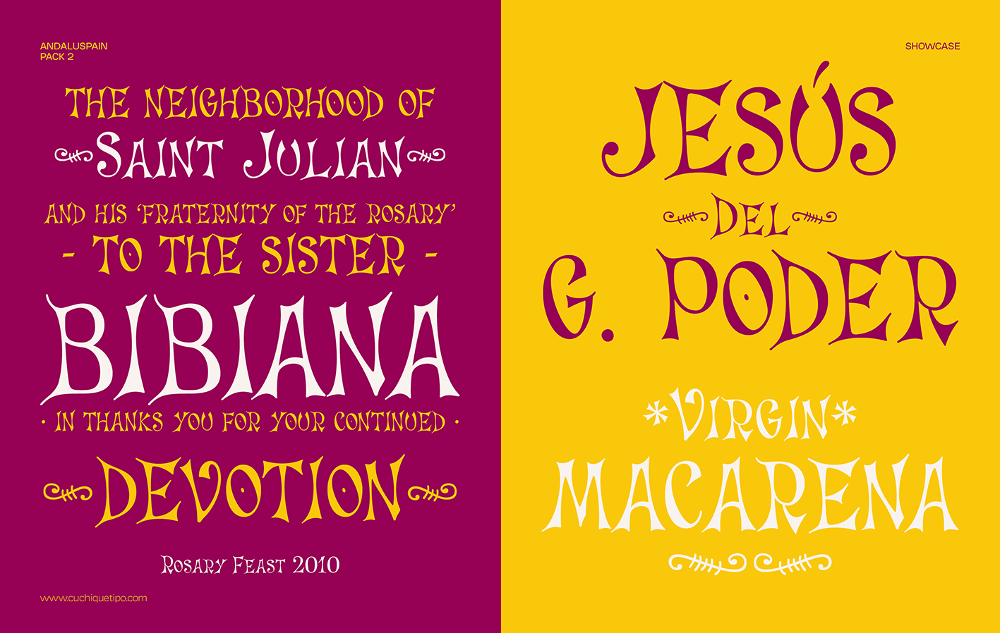


Second part of this project where you can find the digital interpretation in four typefaces of the most emblematic signs of Andalusia: ornate painted letters from Triana, carved bas-relief marble stone from Jaén, or tiles with the artistic mood from Seville, among others. The fact of converting these traditional lettersigns to typographic software recovers them forever, and allows you to give them new uses (swipe to see more images).
Miau
Cuchi qué Tipo, 2021


Miau is a decorative typeface, designed only to be used for letters or single words. Its origin and main concept is based on experimenting with shapes that play the extreme of readability. We have from the thinnest and lightest version (Hiss), to the thickest, dense and compact (Purr), passing through the average (meow). You can see it animated here (swipe to see more images).
Chavea
Cuchi qué Tipo, 2020
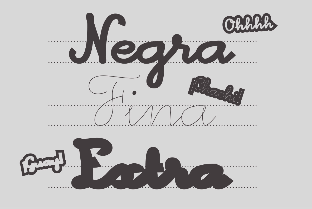
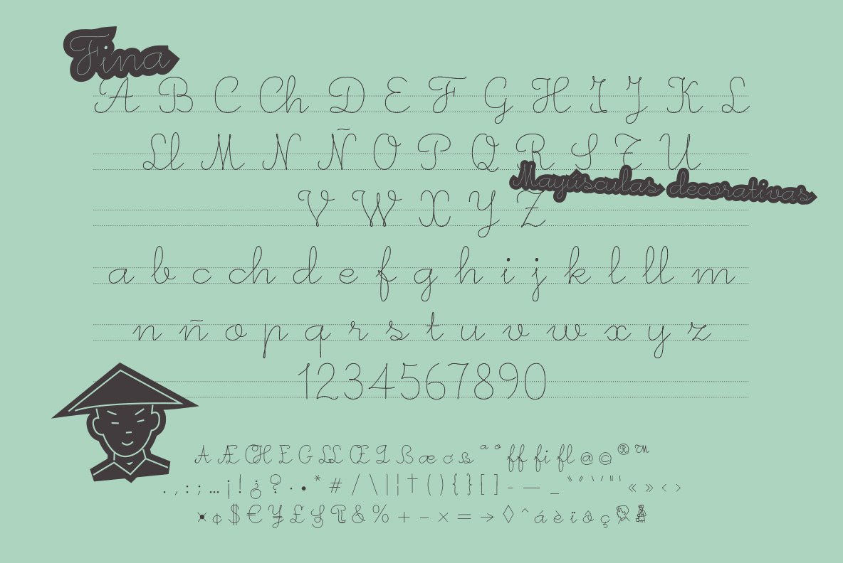
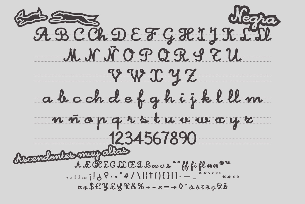
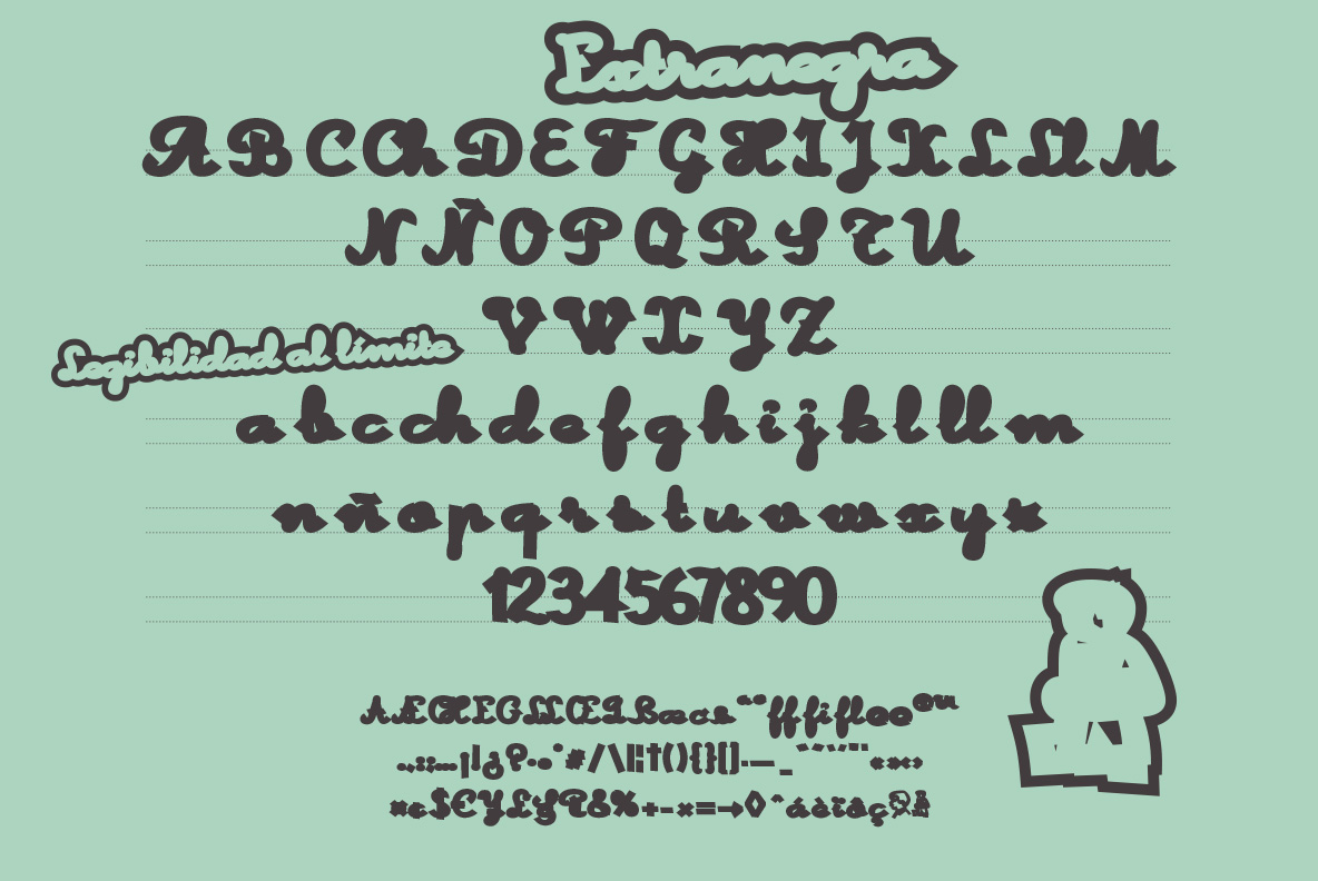


Chavea is a calligraphic font. It is inspired by the writing learning books, typical of Spain in the mid - twentieth century. It has three variables in the thickness of the stroke. The variable Fine is the one that best adjusts to the original shapes of the letters in these learning books, while Black is the most usable, and Extra-Black experiments with legibility, pushing the closing of the counterforms to the limit. By the way "Chavea" comes from gipsy languaje "Caló", and means boy or kid. You can see it animated here (swipe to see more images).
Gajorra
Cuchi qué Tipo, 2018
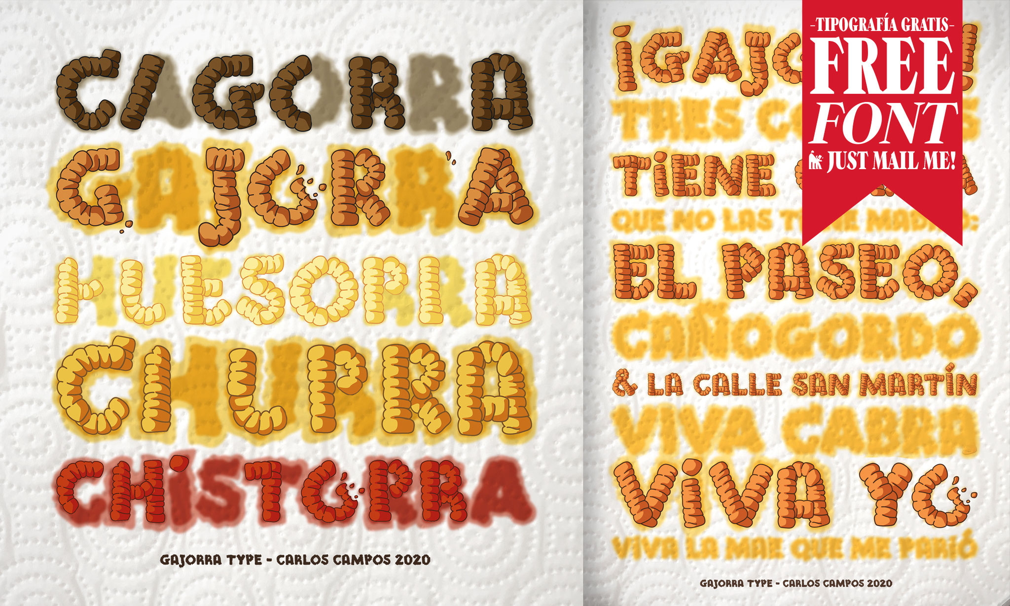
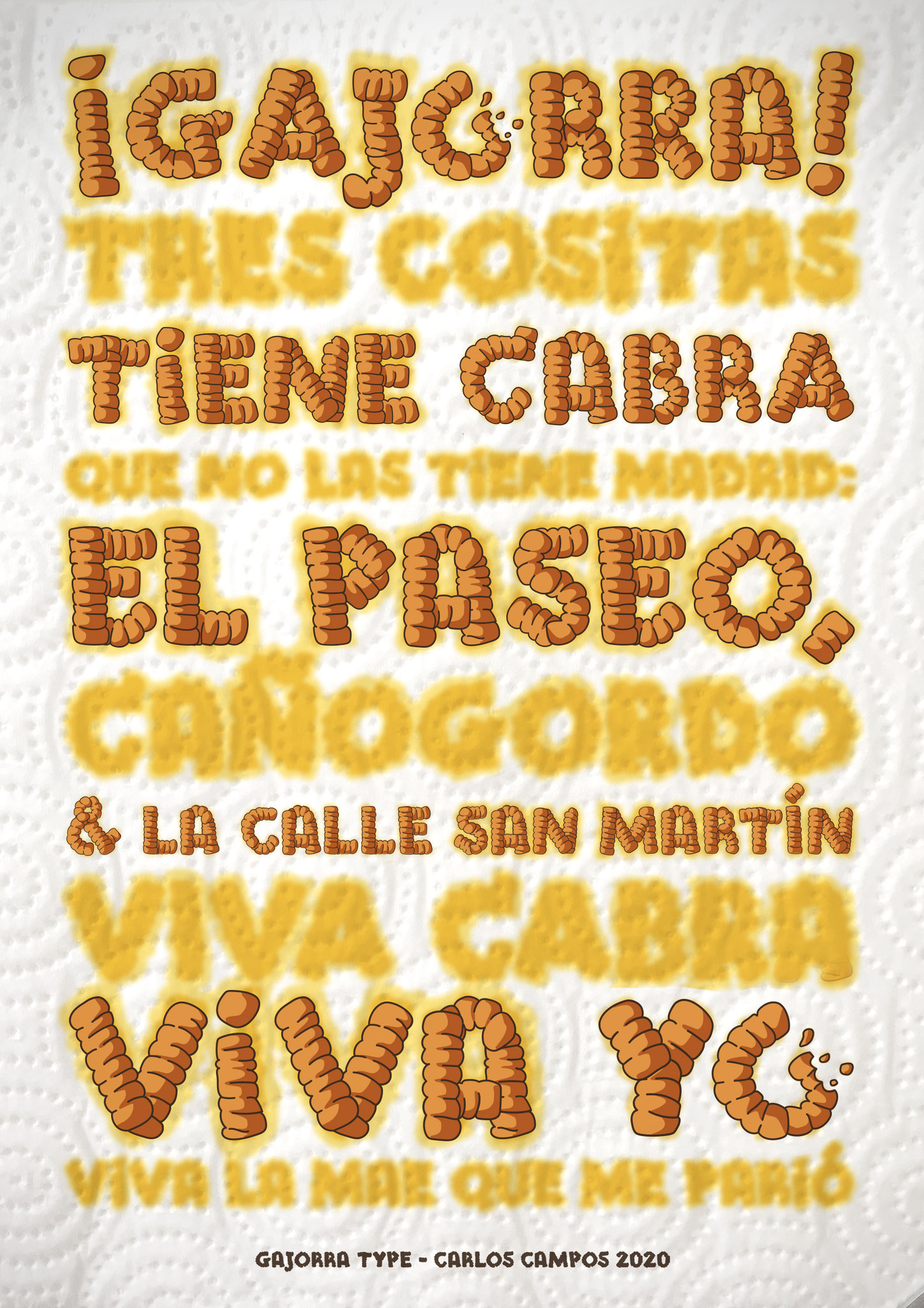
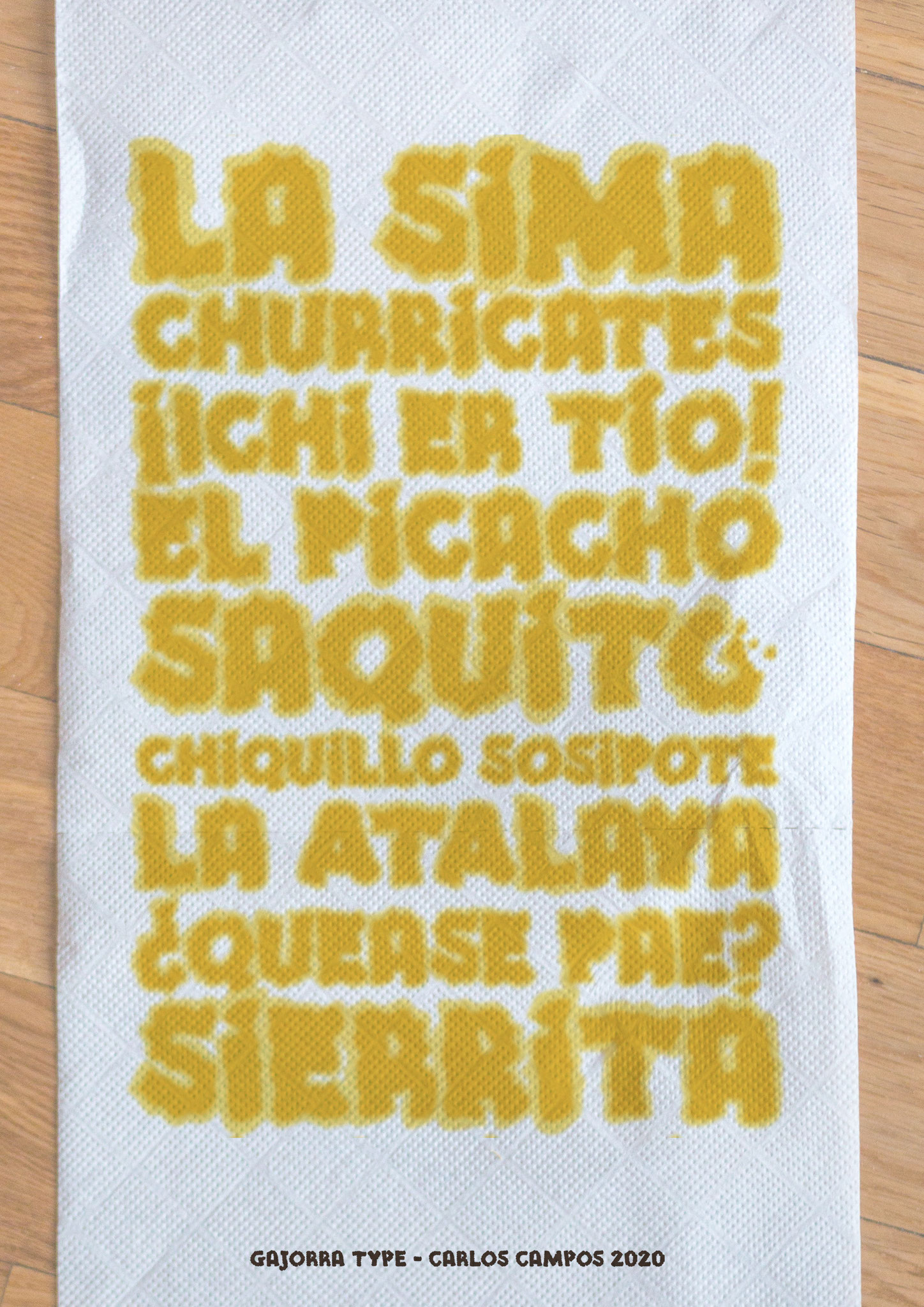


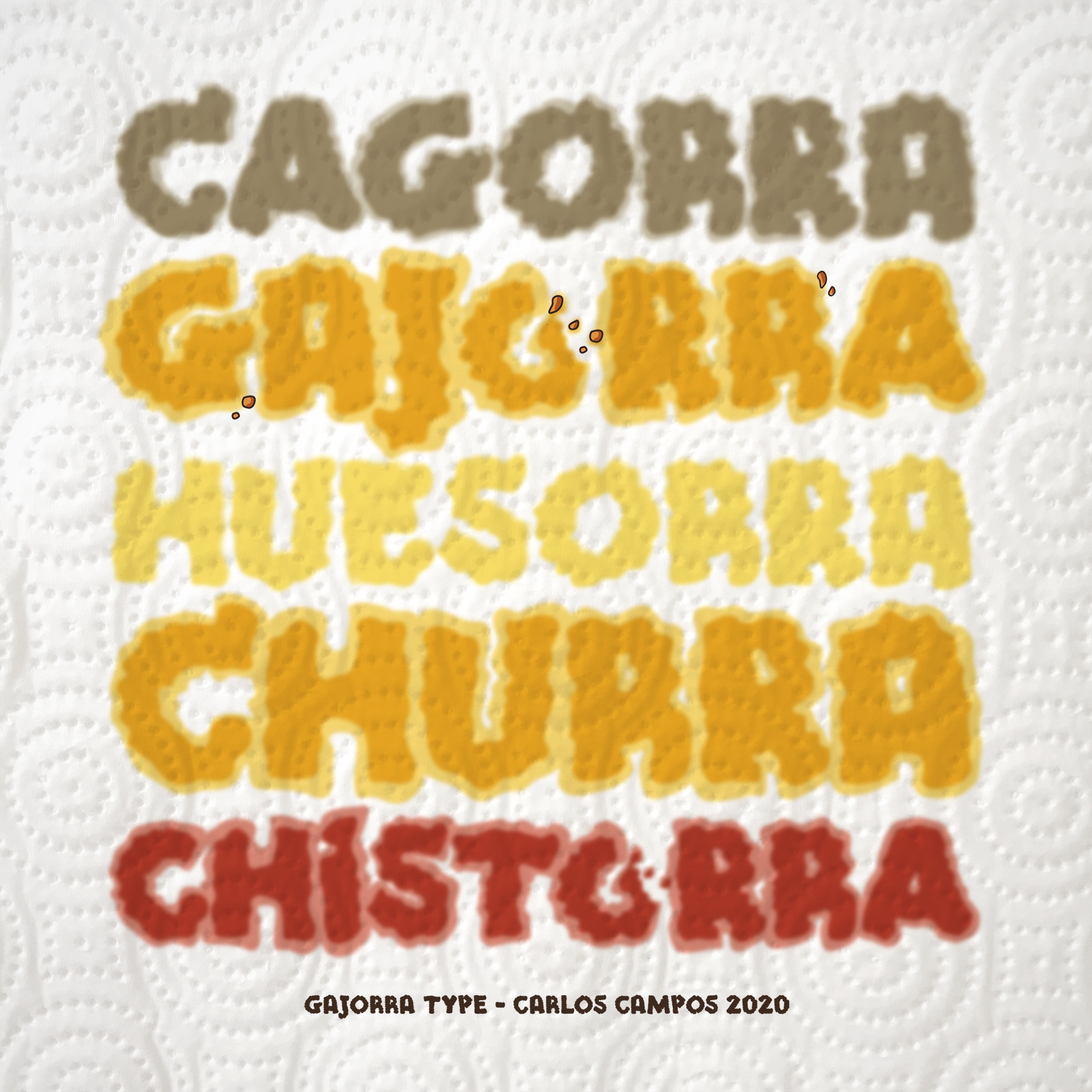


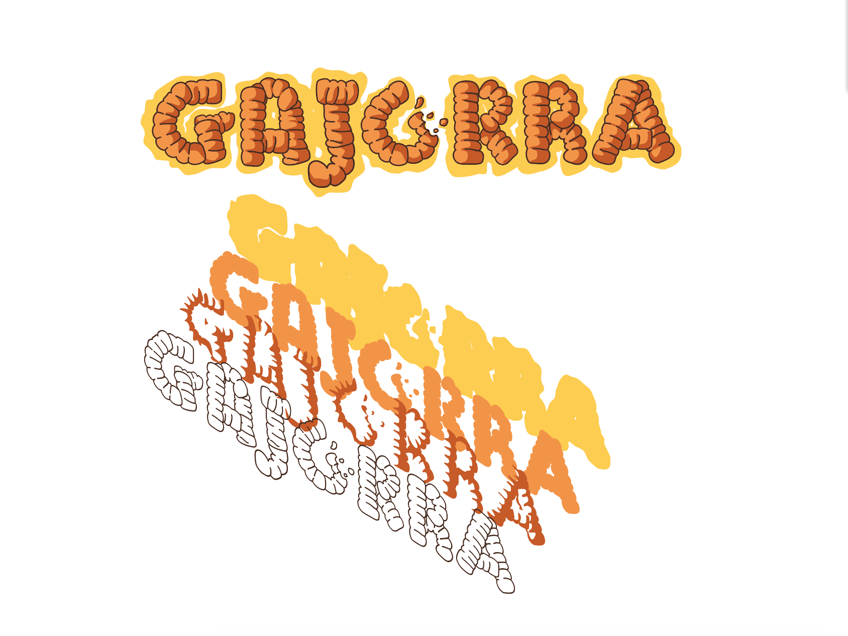
Gajorra is a typeface with more fun than jump off a slide. It is dedicated to one of the most well-known and loved desserts by Egabrenses, the "Gajorros". They are a traditional sweet of the city of Cabra (Córdoba), and they are usually served in Semana Santa. It is a dough that is spirally shaped in a very curious way. The reason of this typeface is just because I wanted to learn how to use the layers and colors in Glyphs. Definitely, a very crazy font! You can see it animated here (swipe to see more images).